Best React Component Libraries for 2024
React has revolutionized the way developers build web applications. Its component-based architecture, virtual DOM, and efficient rendering make it a go-to choice for creating dynamic and interactive user interfaces. However, building everything from scratch can take time and effort, especially for complex applications, so this is where React component libraries come to the rescue.
Best Ready to Use Web Themes & Templates
Bootstrap 5 Templates
Bootstrap One Page Templates, Bootstrap 5 Templates, Free Bootstrap Templates
React component libraries offer pre-designed and pre-built components that developers can easily integrate into their projects. These libraries encapsulate common UI patterns, such as buttons, forms, navigation bars, and more, saving developers valuable time and effort. Moreover, they maintain consistency across applications, adhere to best practices, and often come with extensive documentation and support.
Benefits of Using React Component Libraries
- Speed Up Development Process: By leveraging pre-built components, developers can significantly accelerate the development process. Instead of reinventing the wheel for every UI element, they can focus on building core features and functionality, leading to faster time-to-market.
- Consistency and Reusability: React component libraries promote consistency in design and user experience by providing standardized components. Developers can reuse these components across multiple projects, ensuring uniformity and reducing maintenance overhead.
- Enhanced Productivity: With a vast array of components readily available, developers can concentrate on solving higher-level problems rather than getting bogged down with repetitive UI tasks.
- Community Support and Updates: Many React component libraries are open-source projects with active communities so developers can benefit from community-driven enhancements, bug fixes, and new features. Additionally, community support forums and documentation provide valuable resources for troubleshooting and learning.
- Responsive Design and Accessibility: Most modern React component libraries use the principle of responsiveness and accessibility in mind. They offer responsive layouts and ensure that components are accessible to users with disabilities, helping developers create inclusive web applications.
Let’s have a look into the following Popular React Component Libraries
Ant Design
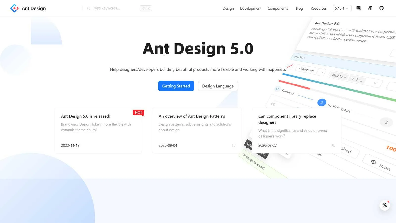
If you seek a React-based UI component library for crafting enterprise-level products, Ant Design stands out as a superb choice. It promises to enhance your work experience by facilitating both enjoyment and productivity.
Renowned enterprises such as Alibaba, Baidu, Tencent, and others rely on this tool. Ant Design provides a plethora of UI components aimed at enriching your applications and software systems.
Features:
- Ant design packages: These packages are useful for mobile, data visualization, graphic solutions, etc.
- Ant Design Pro: AntD’s other variant Ant Design Pro comes with features like templates and a design kit apart from components to help you design your applications.
- Components: You can use 50+ pre-made components directly on your projects instead of creating them from scratch. These components include buttons, icons, typography, layouts, navigation, data entry, data display, feedback, etc.
- Responsive Design: Ant Design components are built with responsive design principles in mind, ensuring that they adapt seamlessly to various screen sizes and devices. This makes applications developed with Ant Design suitable for desktops, tablets, and mobile devices.
Blueprint
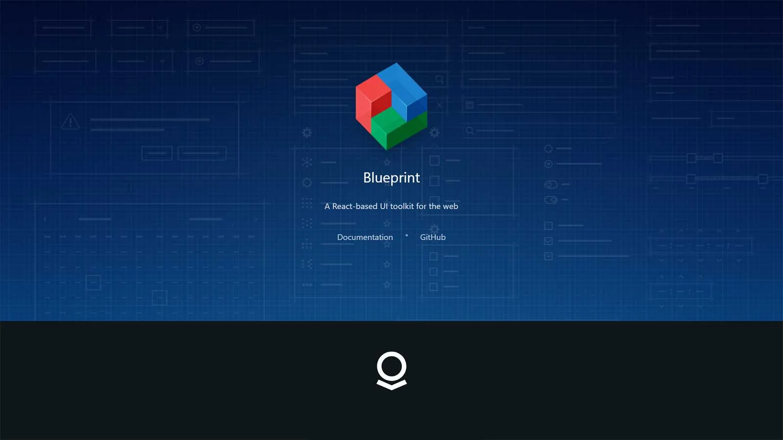
Blueprint is a React-based UI toolkit ideal for constructing web applications. Developed by Palantir, an organization renowned for enhancing customer experiences through data-driven applications, Blueprint offers a wealth of features for crafting sophisticated interfaces.
Tailored for data-dense and intricate interfaces, Blueprint is particularly well-suited for desktop applications. Garnering over a thousand stars on GitHub, this open-source project signifies its popularity and robustness in the developer community.
Features:
- Real-time compositing: Using a tool, Composer, will help you perform compositing in real time and improve your application’s user interface.
- Accessibility: many users find Blueprint as one of the most accessible libraries out there. You can easily install it through npm in the command prompt.
- Developer-friendly: Blueprint offers a complex UI to allow developers easily build heavy, feature-rich web interfaces having several components and modules.
- Themes: It doesn’t have different varieties of themes but you will get unique dark and light mode themes along with design elements such as color schemes, classes, typography, etc.
- Customization: Developers can use CSS and customer each component to suit their project needs with ease.
Chakra UI
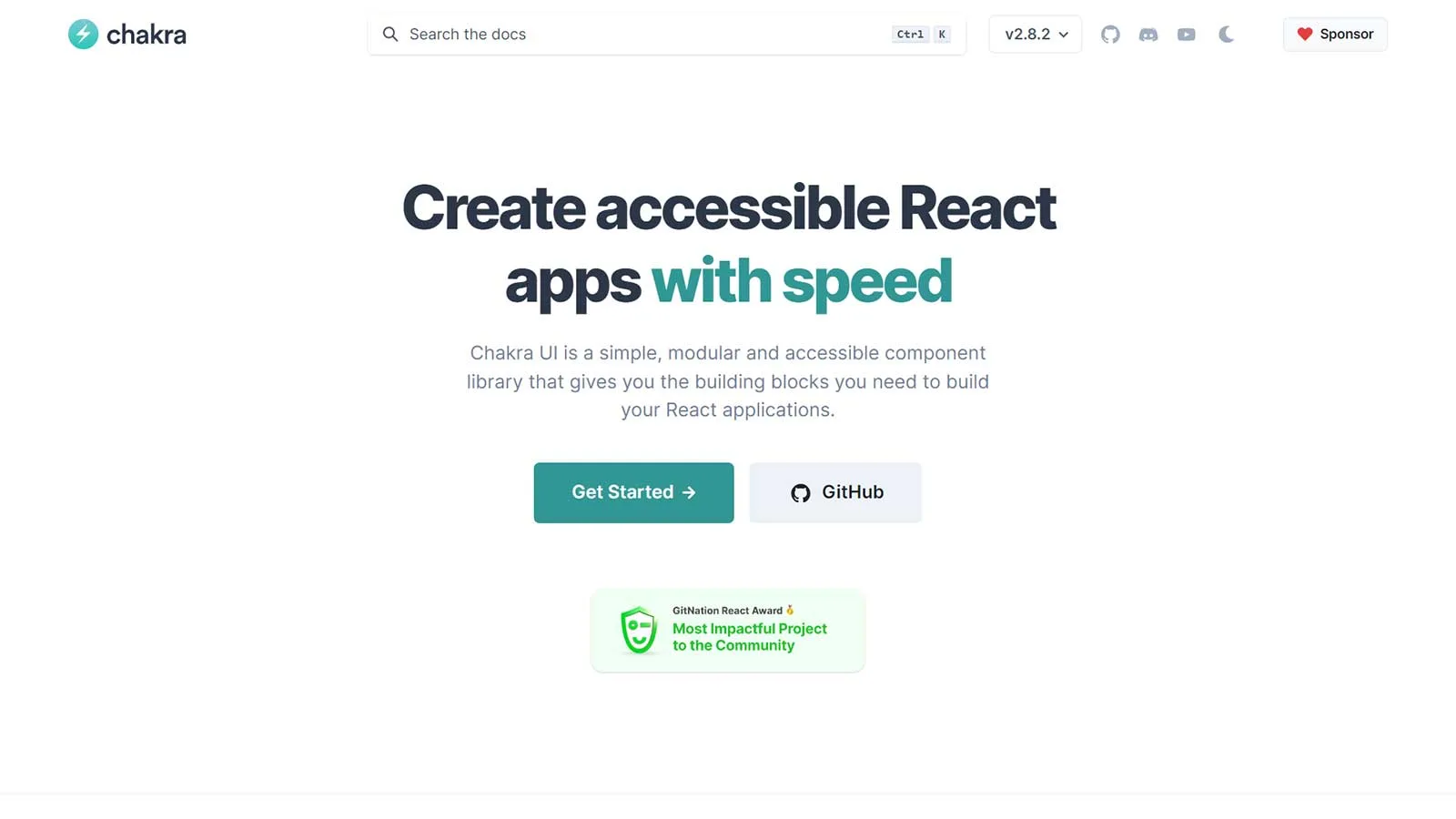
Build your React applications effortlessly using Chakra UI, a straightforward, inclusive, and adaptable component library. Equipped with essential building blocks, Chakra UI empowers you to integrate valuable features into your applications, ensuring user satisfaction.
Chakra UI’s popularity is on the rise. Boasting 1.3 million monthly downloads, 19.7k stars on GitHub, a vibrant community of 7.4k members on Discord, and supported by 10k core contributors, Chakra UI stands as a testament to its widespread adoption and support within the development community.
Features:
- Dark and light UI: Chakra UI is optimized for different color modes that you can use based on your design needs. You can use dark or light mode wherever you feel suitable and build amazing UIs for your applications.
- Customization: You can easily customize any part of the components it provides to complement your design requirements. Whether it’s theming, templates, settings, or anything else, you can make the best use of this design tool.
- Composable: it’s effortless to compose new elements with Chakra UI due to its easy-to-use interface and navigation. You can find each feature easily and play with them to create your design elements without hassles.
- Accessibility: Chakra UI follows WAI-ARIA standards in its components, making your applications easily accessible.
Evergreen
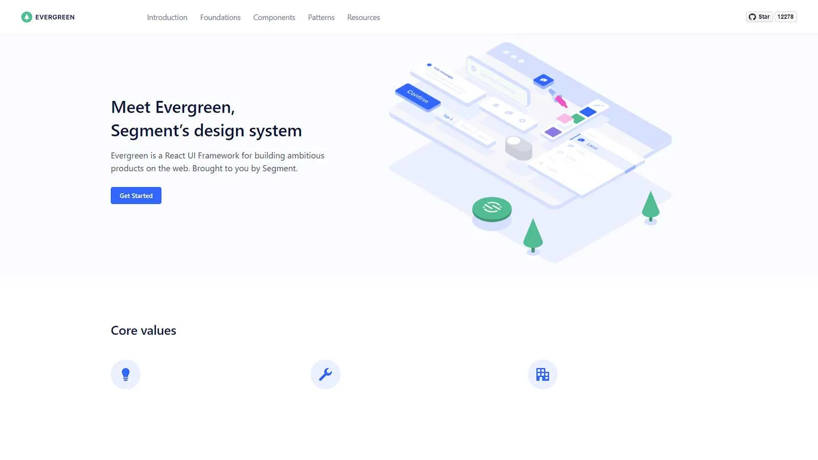
Evergreen, provided by Segment, is an exceptional React UI library tailored to elevate the creation of delightful software products. More than just a set of components, it functions as a flexible design system, liberating developers from rigid configurations and outdated integrations.
Empowering developers to craft software products that seamlessly adapt to evolving design requirements, Evergreen boasts a rich array of features, components, and advantages. Its offerings are meticulously designed to enable the development of user-friendly and robust interfaces, ensuring a seamless and engaging user experience.
Features:
- Quick installation: installing Evergreen’s UI package is quick and easy. Thus, you can get started with this tool without any hassle and start building the apps.
- Components: Evergreen has 30+ polished components that allow you to work out of the box. It includes typography, colors, buttons, badges, pills, patterns, layouts, and more. These are created on top of React-based UI primitives to enable endless composability.
- Theming: Evergreen offers two themes – default and classic. The default theme reflects the current brand of Segment, while the classic theme originates from Evergreen’s first version. Although Evergreen lacks a theme builder, you will get a comprehensive theming system to customize the components as per the design requirements.
- Flexibility: Evergreen prioritizes flexibility, allowing developers to create interfaces tailored to their specific needs without being constrained by rigid configurations. This flexibility enables seamless integration into a variety of project architectures.
- Modularity: The libraries are designed with modularity in mind, allowing developers to mix and match components to suit their requirements. This modular approach facilitates code reusability and maintainability, resulting in more efficient development workflows.
Fluent 2
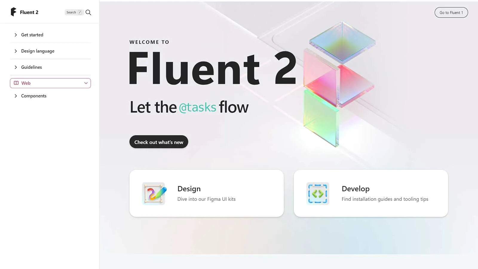
Fluent, formerly known as Fabric React, serves as a cross-platform, open-source design tool designed to facilitate the development of captivating user experiences. Crafted by Microsoft, this exceptional UI library excels particularly in the realm of cross-platform applications. Nonetheless, its versatility renders it equally suitable for a diverse array of other projects.
Both developers and designers stand to gain from its valuable tools, enabling them to effortlessly incorporate design elements into their applications without starting from square one. This robust and intuitive tool is engineered to adapt to user intent and behavior seamlessly.
Features:
- Performance: Each component you use from Fluent to build your application parts will perform optimally. It will provide a professional yet user-friendly look and feel to your applications. In addition, it takes a straightforward approach by applying CSS to each of its elements. Therefore, even if you change an element, it won’t impact your style.
- Pre-built components: Fluent offers multiple pre-built components to help you develop your application’s different parts in the design language of Microsoft Office. It includes components like buttons, grids, checkboxes, notifications, menus, essential inputs, toolboxes, and more. You can also customize them easily to suit your use case.
- Accessibility: Fluent is created with easy accessibility in mind so that any user can access and use it without any hassle.
- Controls: you can get better control of your designs with tools like Datepickers, people pickers, persona, etc.
Grommet
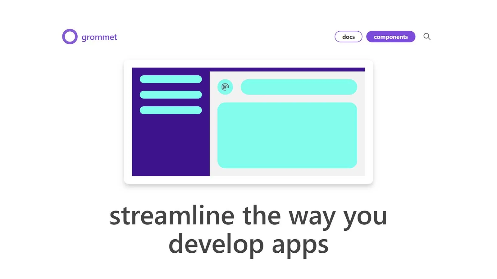
Grommet stands as a versatile React framework bundled neatly with features encompassing responsiveness, theming, accessibility, and modularity. Its streamlined package aids in simplifying software development through an intuitive UI component library.
For those seeking a robust design system catering to accessible and responsive mobile-first web projects, Grommet emerges as a top choice. Developed by HPE, it offers a dynamic design experience, ensuring a vibrant journey through the design process.
Features:
- User-friendly interface: It is an easy to access UI library with tools like keyboard navigation and screen reader tags. It also supports Web Content Accessibility Guidelines (WCAG). It’s a great tool for beginners.
- Theming: There are plenty of pre-packaged themes available on Grommet – Grommet theme designer and Grommet designer. The former is a demo admin panel that lets you develop customized Grommet themes by adjusting elements. The latter is a canvas to create and save your design experiences with the components.
- UI components: characterized by robust design and lightweight construction, ensuring optimal app size management. Its component categories span layouts (e.g., footers, headers, grids), type (headings, paragraphs), color (branding, accents), controls (buttons, menus), inputs (text, checkboxes), media (video, carousels), utilities (responsive elements, infinite scroll), and visualizations (calendars, charts).
Headless UI
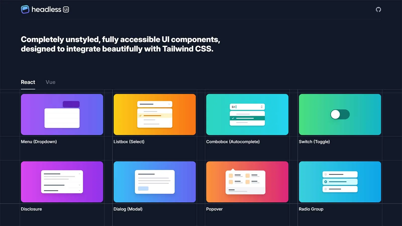
Tailwind Labs presents Headless UI, a suite of fully-accessible and unstyled UI components meticulously crafted to seamlessly integrate with Tailwind CSS. Renowned for its versatility, it stands out as a top choice for React-based projects, boasting over 54.5k stars on GitHub.
By decoupling application logic from visual elements, Headless UI empowers developers to streamline UI development without compromising on accessibility. With its robust utility-focused CSS library featuring classes like rotate-90, text-center, pt-4, and flex, building applications becomes effortless, keeping your focus squarely on HTML development.
Features:
- Accessibility and transitions: Headless UI offers complete accessibility and transition information so that users won’t find it a headache to access and use the tool in their applications. For this, you will get an extensive API as well.
- UI components: You get many UI components such as a menu, list box, switch, combo box, dialog, disclosure, dialog, radio group, popover, transition, tabs, auto-complete, toggle switch, and more.
- Customization: customizing each component is simple as you will get easy-to-understand examples and styling guidance for each component. This way, you can build your features suitable to your specific app needs.
Mantine
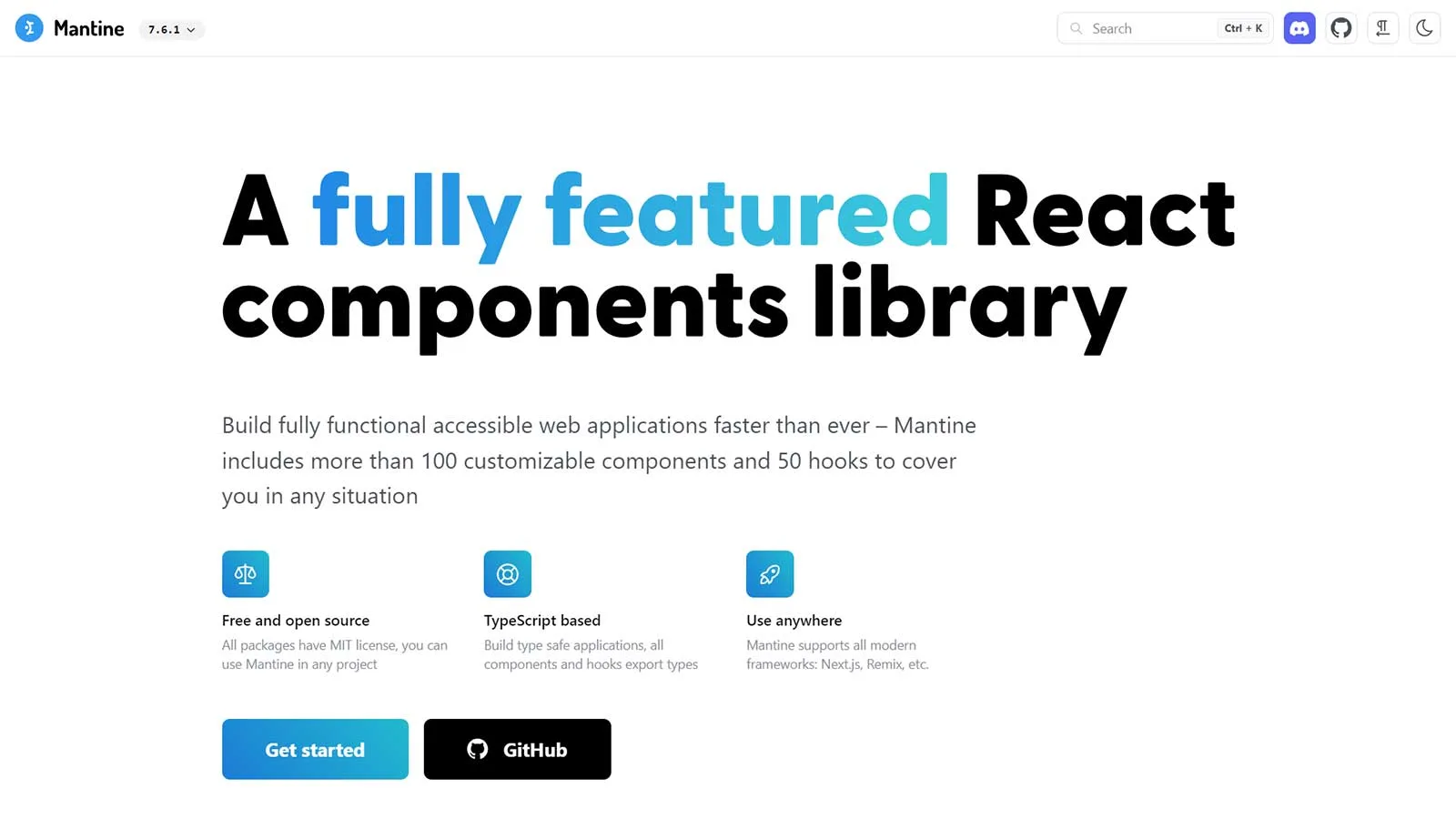
Mantine stands out as a comprehensive React UI components library, empowering rapid development of web applications and sites. Designed for accessibility and flexibility, it offers over 100 customizable components and more than 40 hooks to enhance your development process.
As an open-source tool, Mantine is freely available under the MIT license. Built on TypeScript, it boasts compatibility with various frameworks, ensuring versatility in your projects.
Features:
- Dark color scheme: You can add a dark theme to the app you are building with a little coding. Mantine can export global styles for dark and light themes alike.
- Flexible theming: You don’t have to limit yourself to the default theme; you can extend it with additional colors, radius, spacing, fonts, etc., to complement your designs.
- Customization: Each component in Mantine can be customized visually with props. This helps you quickly build a prototype and keep experimenting by modifying the props.
- Flexible theming: You don’t have to limit yourself to the default theme; you can extend it with additional colors, radius, spacing, fonts, etc., to complement your designs.
MUI
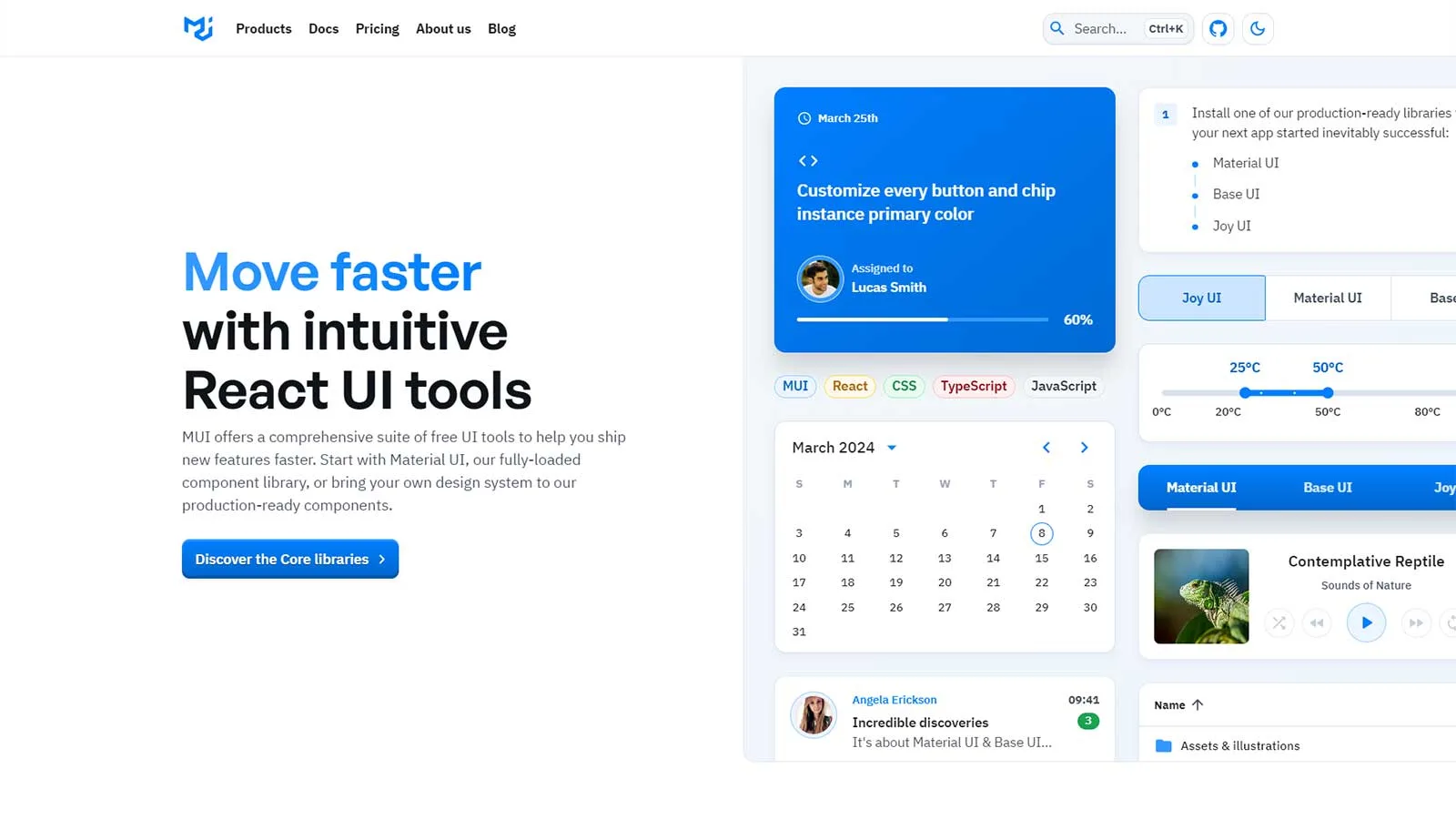
Previously known as Material-UI, MUI has garnered significant attention on GitHub, emerging as one of the most sought-after React UI component libraries. Its components are rooted in React but embrace Google’s Material Design philosophy. Material Design draws inspiration from real-world textures while maintaining a minimalist approach to UI elements.
MUI boasts an extensive selection of useful components, including app bars, autocomplete, badges, buttons, cards, dialogs, icons, menus, sliders, and beyond. Additionally, MUI provides React themes and templates, enabling users to customize their app’s color scheme to suit their preferences.
Features:
- Rich Component Library: MUI provides a wide array of reusable UI components such as app bars, autocomplete, badges, buttons, cards, dialogs, icons, menus, sliders, and many more. These components are meticulously crafted to be highly customizable and adaptable to various use cases.
- Accessibility: Accessibility is a core focus of MUI, ensuring that all components are designed to be usable by individuals with disabilities. This includes features like keyboard navigation, ARIA attributes, and focus management.
- Theming Support: MUI offers robust theming capabilities, allowing developers to easily customize the appearance of their applications. With support for custom color palettes, typography, and spacing, developers can create cohesive and visually appealing designs that align with their brand identity.
- Material Design Philosophy: MUI components adhere to Google’s Material Design principles, which emphasize clean and intuitive interfaces inspired by real-world objects and textures.
React Admin
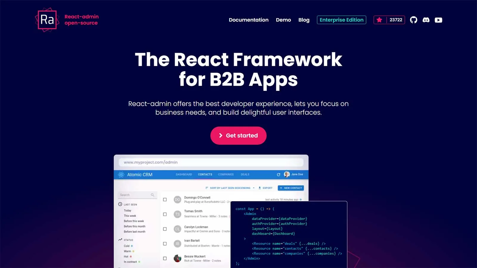
If you’re seeking a React framework tailored for B2B application development, React-admin stands out as a favorable choice. Its primary objective is to deliver exceptional experiences to developers, allowing them to concentrate on meeting their business objectives.
As an open-source tool licensed under MIT, React-admin is renowned for its robustness, stability, ease of learning, and overall enjoyable development experience. It’s no surprise that over 10,000 companies worldwide have opted to leverage React-admin for their projects.
Features:
- Accessibility and responsiveness: React-admin is built to be accessible and responsive to anyone using different devices. This way, it aims to enhance the user experience of what device they use and where they are located globally.
- Integration: React-admin can work with any API. It is backend agnostic. You can also find adapters compatible with most GraphQL and REST dialects or write the code yourself in a few minutes. It can integrate seamlessly with OpenAPI, Django, Firebase, Prisma, and more.
- Theming: you will get different options for theming to make your user interface attractive yet useful.
- Modern design: You can create API based apps with this tool that comes with modern material designs.
- Faster: This tool has the capability of accelerating your work speed. In as little as 13 lines of coding, you can get started with it.
Next UI
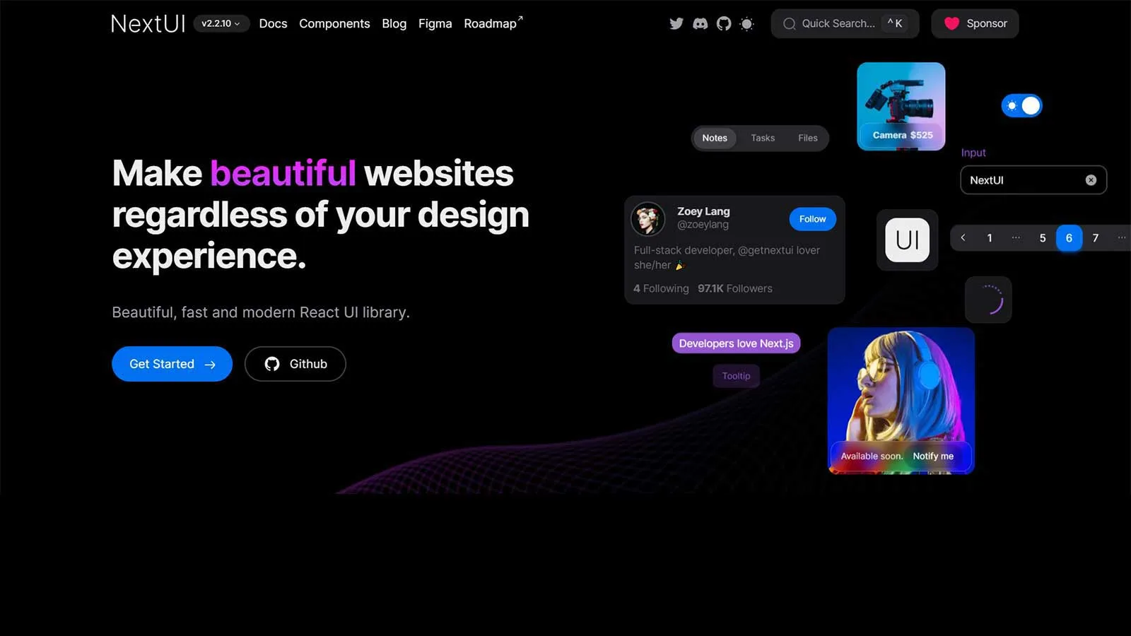
Regardless of your level of expertise, crafting websites and applications is a breeze with NextUI. This contemporary React UI library is not only swift but also visually stunning, ensuring you can dive right in with ease.
NextUI holds great promise with its array of features and intuitive interface. Its components facilitate seamless server-side rendering across various browsers, promising a smooth and consistent user experience.
Features:
- Light and dark UI: You will get automatic recognition for dark mode. NextUI can automatically change your theme by detecting prop changes in the HTML theme. Its default dark theme is well scaled and easy to apply with less coding.
- Unique DX: NextUI is fully typed, which helps reduce the learning curve while providing better developer experiences. Also, developers don’t need to import several components in order to showcase just one. Hence, you can do more by writing less code.
- Faster: NextUI eliminates unwanted style props during runtime. This makes the tool better performing than other React UI libraries.
- Themeable: It offers an easy way to customize the default themes available. You can easily modify the fonts, color, breakpoints, etc.
- Server-side rendering: NextUI’s components facilitate cross-browser server-side rendering that you can easily apply to your applications.
Onsen UI
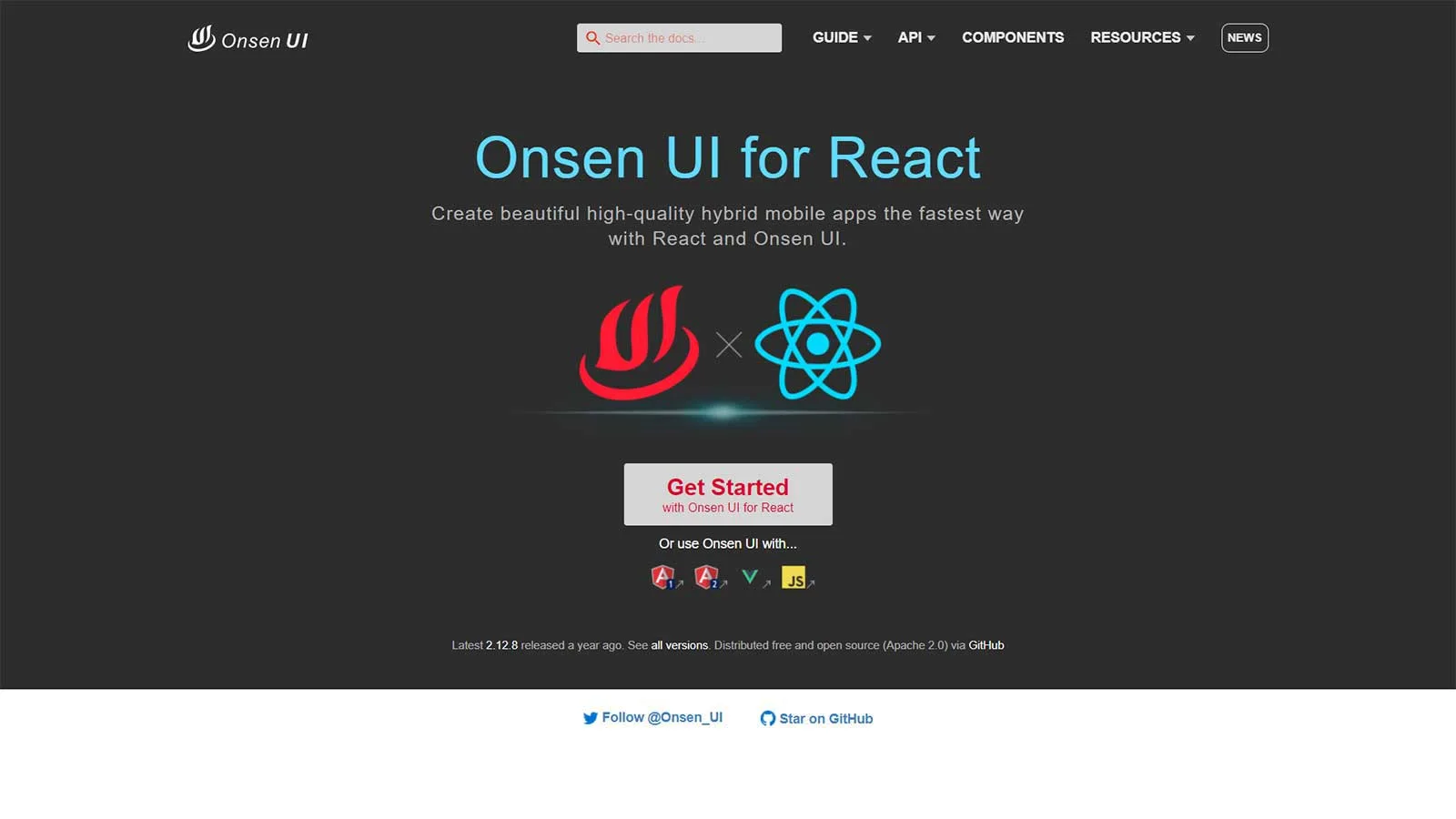
If you’re delving into cross-platform mobile app development and seeking a React UI component library, Onsen UI should pique your interest. Utilizing HTML5 and JavaScript, Onsen UI serves as a mobile app development framework, seamlessly integrating with Angular, Vue.js, and React. Its components are auto-styled based on the platform, ensuring compatibility with both iOS and Android from the same source code base.
Onsen UI boasts compatibility with numerous popular React frameworks and offers an interactive tutorial to facilitate a smooth start with the tool. Leveraging pure CSS with no JavaScript behavior, the component library also incorporates custom elements for additional customization. With over 8,500 stars on GitHub, it stands as a well-received choice within the development community.
Features:
- Auto-Styled Components: The components in Onsen UI are auto-styled based on the platform, which means that they adapt their appearance to match the native look and feel of iOS and Android devices. This ensures a consistent and intuitive user experience across different platforms.
- Cross-Platform Compatibility: Onsen UI components are designed to work seamlessly across various platforms, including iOS and Android. This cross-platform compatibility ensures that developers can write code once and deploy it across different operating systems.
- Integration with React: Onsen UI provides native support for React, allowing developers to leverage the power of React’s component-based architecture to build robust and scalable mobile applications.
- Support for Popular React Frameworks: Onsen UI is compatible with many popular React frameworks, making it easy for developers to integrate it into their existing projects and workflows.
Storybook
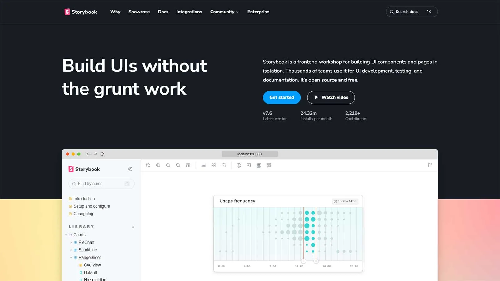
Storybook has garnered widespread acclaim over time. While it doesn’t function as a standalone component library, it serves as an invaluable open-source tool for crafting UI components in isolation, compatible with React and numerous other platforms and technologies. What distinguishes Storybook is its capability to focus on individual components, thereby accelerating development processes significantly.
The Storybook GitHub repository enjoys the endorsement of thousands of stars, underscoring its popularity among developers. For the latest major releases and incremental updates, developers can reliably refer to the Storybook release page, ensuring they stay abreast of the latest enhancements and features.
Features:
- Interactive Component Playground: Storybook offers an interactive playground where developers can experiment with different props, states, and configurations of their components in real-time. This allows for rapid iteration and exploration of component behavior.
- Isolated Development Environment: Storybook provides an isolated development environment where developers can work on individual UI components in isolation. This allows for focused development and testing of components without the need to navigate through the entire application.
- Customizable Theme and Layout: Storybook offers flexibility in customizing the theme and layout of the UI. Developers can customize the appearance of Storybook to match their brand or preferred design aesthetic, enhancing the overall developer experience.
- Support for Various Platforms: Storybook supports not only React but also other popular frontend frameworks and libraries, including Angular, Vue.js, and more. This allows teams working with different technologies to leverage the benefits of Storybook in their development process.
Shards React
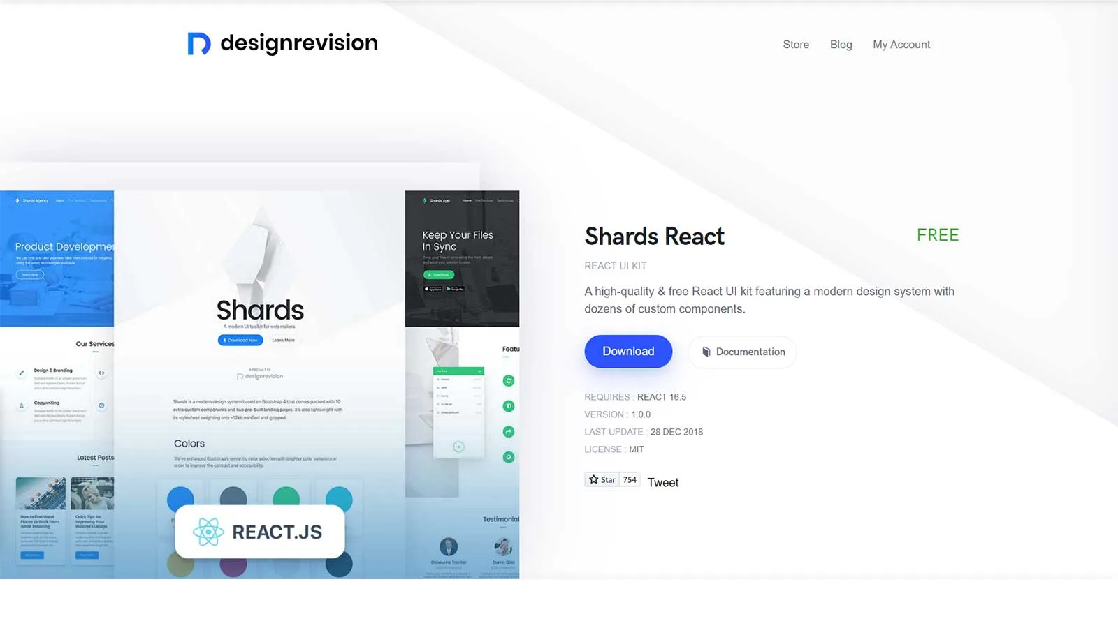
Shards React represents a cutting-edge, open-source React UI kit meticulously crafted for optimal performance from the ground up. Its contemporary design system offers extensive customization options, enabling users to modify various aspects of the interface effortlessly.
Moreover, the availability of downloadable source files facilitates code-level alterations, granting developers even greater control over customization. The utilization of SCSS for styling further elevates the developer experience, fostering smoother and more efficient workflow.
Features:
- Fast Performance: Geared towards fast performance, Shards React prioritizes speed and efficiency, ensuring smooth user experiences even in demanding applications.
- Open-Source and Built from Scratch: As an open-source project, Shards React provides transparency and accessibility to developers. Built entirely from scratch, it offers a fresh and optimized approach to React UI development.
- SCSS Styling: Shards React utilizes SCSS (Sass) for styling, enhancing the developer experience by offering a more powerful and flexible way to manage stylesheets. SCSS simplifies styling tasks and promotes code organization and reusability.
- Integration with Popular Tools: Shards React seamlessly integrates with popular tools and libraries such as React Datepicker, React Popper (a positioning engine), and noUISlider, providing additional functionality and versatility to developers.
Theme UI
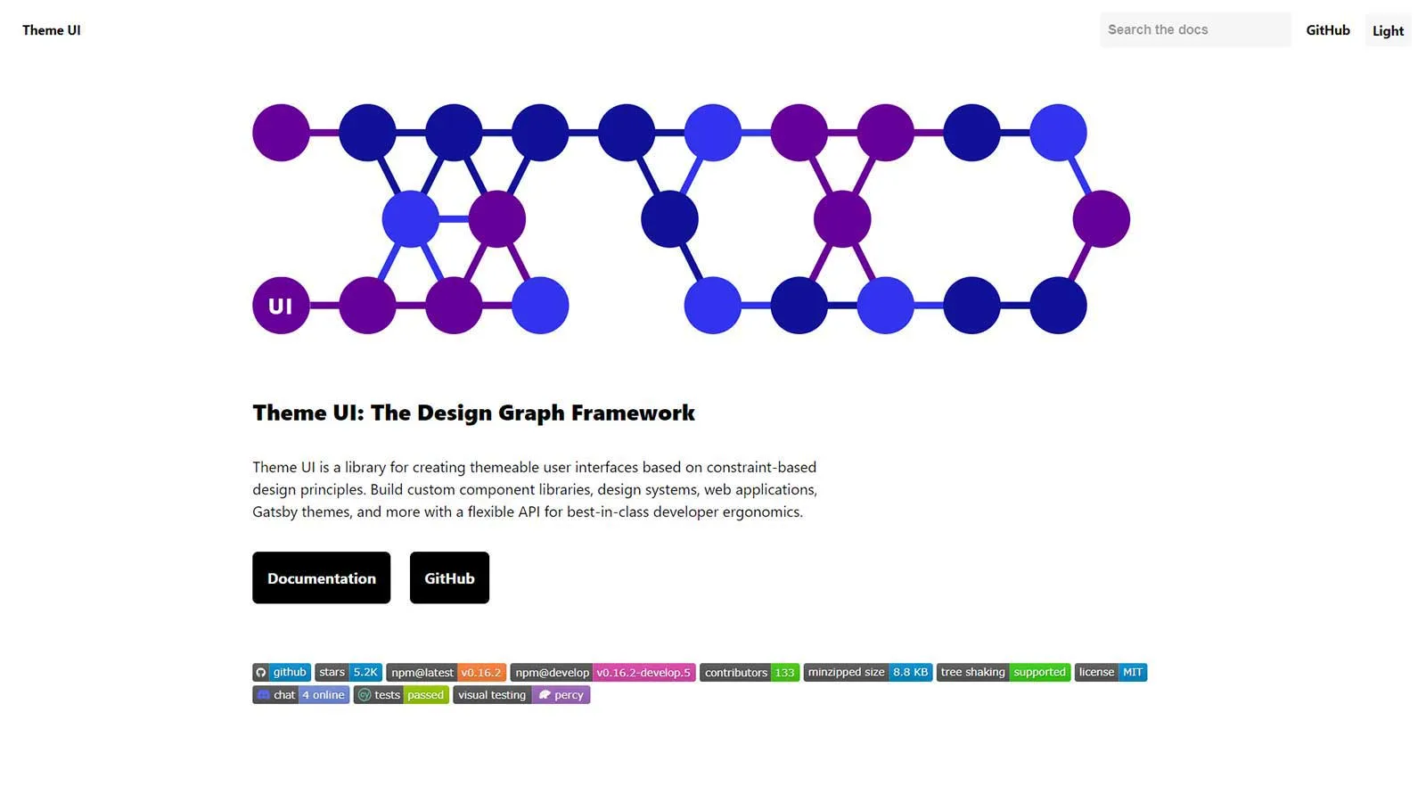
When it comes to crafting themeable React-based UIs, Theme UI emerges as a standout option. This versatile tool empowers developers to construct a wide array of projects, from web applications and design systems to custom component libraries and Gatsby themes, with unparalleled flexibility.
Theme UI prioritizes top-notch developer ergonomics and adheres to constraint-based design principles, facilitating a streamlined and efficient design process. Utilizing Theme UI typically involves two main steps: Building the Theme: Developers can define colors and fonts to create a cohesive and customizable theme that sets the visual tone for the project. Styling Components: With Theme UI, developers can style each component individually, enabling precise control over the appearance and behavior of their applications or sites.
Features:
- Themeable: Reference values out of your themes effortlessly through your complete site or app on any component you want. It has a Theme Specification and a Theme aware sx prop for CSS.
- Styling: You can style with/without creating components. Theme UI offers mobile-first, easy, and responsive styles. In addition, it follows an expressive and simple MDX styling.
- Constraint-based: You can use typography, colors, layout scales, etc., by following a constraint-based design.
- Ergonomic: You can style your software products quickly as per your theme with excellent developer ergonomics.
- Dark mode: This tool has a built-in dark mode and a powerful theming API. It also includes plugins for themes and Gatsby sites. This enables you to design static sites.
Rebass
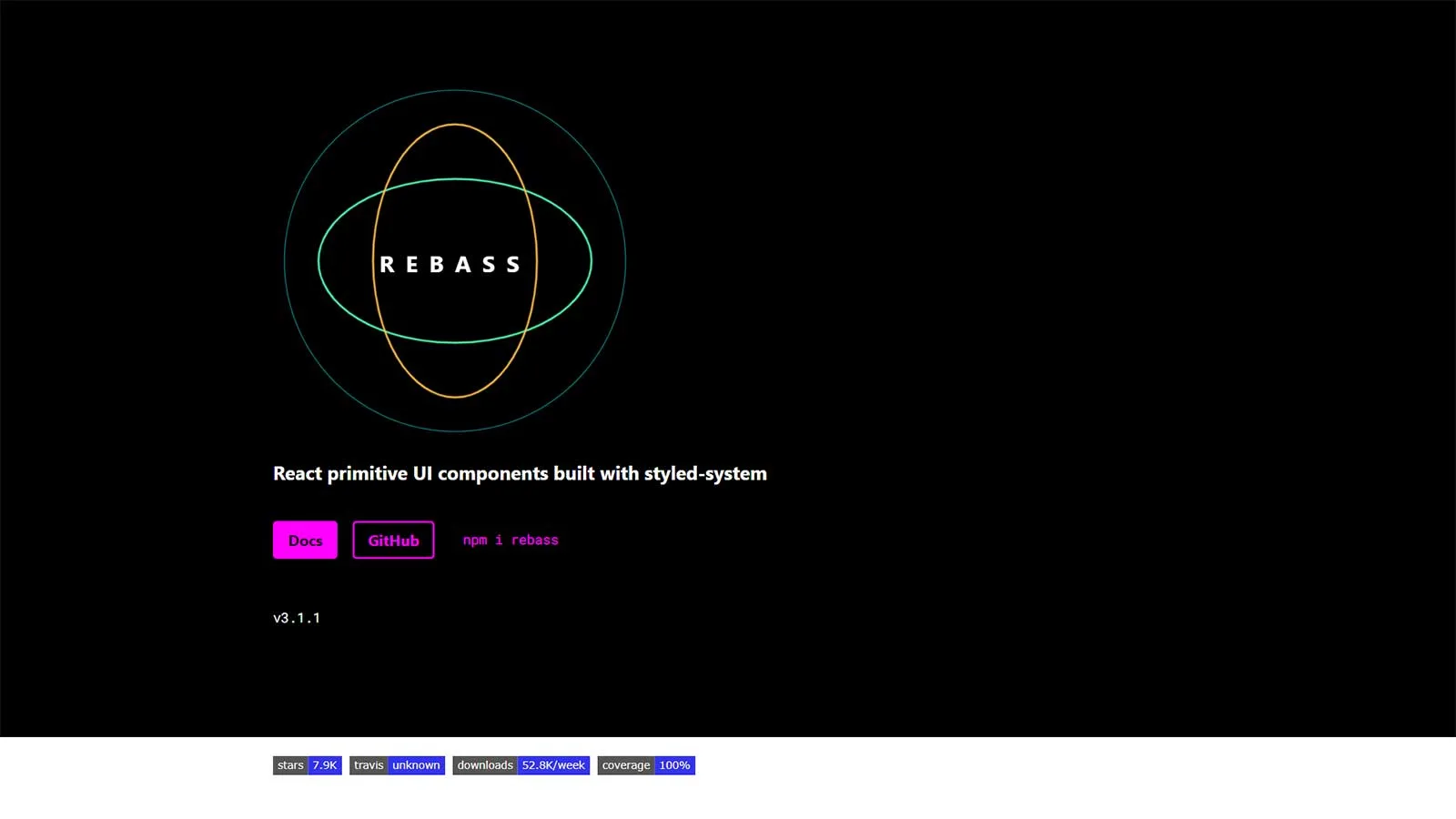
Rebass presents itself as a React-based UI component library equipped with a built-in styled system. Known for its scalability, systematic approach, and responsiveness, Rebass fulfills the essential requirements of businesses. Developed by front-end developer Brent Jackson during his tenure at Gatsby, Rebass offers a solution that streamlines UI development.
This tool seamlessly integrates with CSS-in-JavaScript libraries, eliminating the need for developers to manually write CSS code. Instead, developers can utilize a style object, bypassing the use of embedded CSS strings. This approach accelerates the development process, allowing developers to focus on coding while effortlessly incorporating design elements and themes into Rebass primitives.
Features:
- Components: It comes with a foundational list of primitive UI components that you can extend easily and create a component library. It will also have a consistent style and API defined in a chosen design theme. You will get components like app structure (boxes. Layouts, etc.), images, text, cards, forms, and more.
- Faster Development: By providing a style object rather than requiring developers to write CSS strings, Rebass accelerates the development process. Developers can quickly iterate on their designs and implement new features without getting bogged down in CSS details.
- Lightweight: Rebass consumes only about 4 KB and is very lightweight. This keeps the size of your application in check.
- Customization: Rebass offers extensive customization options, allowing developers to tailor the library to their specific needs. Whether you need to tweak existing components or create custom ones from scratch, Rebass provides the flexibility you need to achieve your goals.
PrimeReact
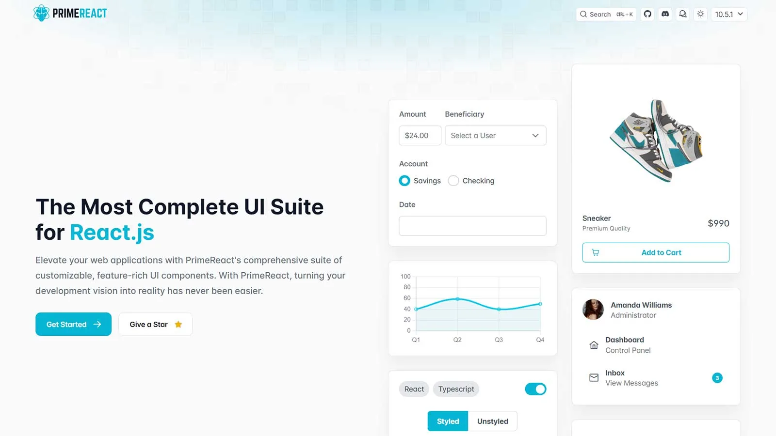
PrimeReact stands as a prominent React UI component library trusted by enterprises and developers worldwide. Renowned companies such as Mercedes, Airbus, Ford, Fox, Volkswagen, eBay, Intel, Nvidia, Verizon, and American Express have embraced its capabilities.
With over 39.5k weekly downloads and more than 2.6k stars on GitHub, PrimeReact showcases its popularity and robustness. Boasting an extensive array of features and components, it offers developers a thrilling journey in UI design.
Features:
- Design agnostic: PrimeReact has a design-agnostic infrastructure that lets you select the look and feel of existing libraries such as Bootstrap and Material UI. However, you are totally free to create one by yourself.
- Components: PrimeReact has 80+ awesome React components to use directly on your designs. Some of the unique ones include captcha, terminal, organization chart, and TreeSelect.
- Theme Designer: The tool features the GUI based Theme Designer with a Visual Designer and over 500 variables that you can modify as per your needs. It will allow you to modify color, font, size, input style, buttons, etc.
- Templates: You will get customizable templates and 280+ UI blocks that you can copy and paste directly while developing your interface. In addition, it has an icon library consisting of over 200 icons.
React Bootstrap
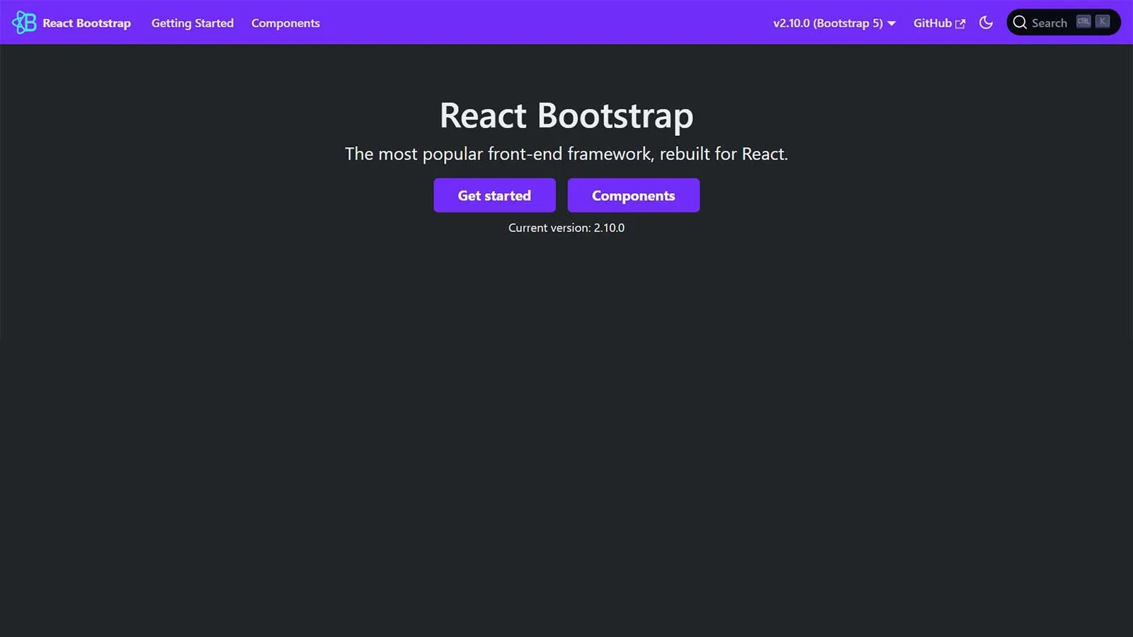
React Bootstrap, a popular front-end framework, has been reimagined for React-based applications and systems. Unlike its predecessor Bootstrap JavaScript, React Bootstrap offers native React components for each element, eliminating dependencies like jQuery.
Despite its early beginnings, React Bootstrap has evolved into an exceptional choice for crafting seamless user interfaces. It provides an array of impressive UI elements tailored for both mobile and web applications.
Features:
- Accessibility: all the components included are developed to be easily accessible to any user or device. Hence, the user will also get better control over each component’s function and form.
- Compatibility: React-Bootstrap is designed to be compatible with a wide range of UIs. It relies completely on the Bootstrap stylesheet and works with multiple Bootstrap themes that you might like.
- Themes: Since Bootstrap is used widely for web development, you will find thousands of paid and free themes available.
- Lightweight: You can minimize the volume of code in your applications by importing just the components you need individually instead of importing the complete library. It will be less time-consuming as well.
Semantic UI React
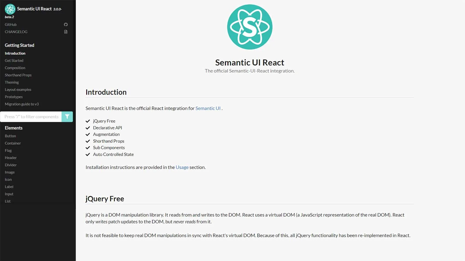
Combining React with Semantic UI can prove to be a strategic move to obtain a tailored UI component library for your projects. Semantic UI React facilitates the creation of sites and applications with simplified and concise HTML. Garnering over 12k stars on GitHub, it enjoys a considerable following among developers.
This tool offers the flexibility to load any CSS theme desired for the application under development. Additionally, it streamlines the development process with its user-friendly HTML syntax, promoting efficient software product development. With a declarative API, Semantic UI React provides robust prop validation and a host of powerful features to streamline development workflows.
Features:
- Easy debugging: With Semantic React UI used on an app, developers find it easier to debug applications. You can easily track issues without keeping on digging through your stack traces.
- Pre-built components: this library offers many components, including buttons, header, containers, and icons. In addition, you will get shorthand props to help create markup automatically.
- Responsiveness: The tool is designed to make your interface responsive, giving you options to figure out the best design for your content and design elements on both mobile and tablet.
- Integrations: The tool has integration with Angular, Ember, Meteor, etc., apart from React. This lets you organize your user interface layer alongside the application logic.
- jQuery Free: Semantic UI React is free from jQuery as it lacks virtual DOM.
React Router
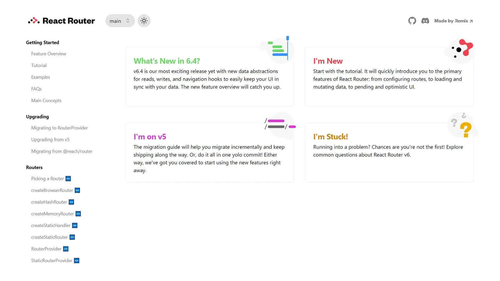
Crafted and upheld by the Remix team and its dedicated contributors, React Router stands as an exceptional React UI component library. Its latest iteration, v6, amalgamates the finest attributes from its predecessors while introducing enhancements.
Esteemed development teams from renowned organizations like Airbnb, Discord, Microsoft, and Twitter have integrated this tool into their projects. Ideal for those seeking a versatile router user interface, React Router adeptly interfaces with various interfaces. It seamlessly associates app components with corresponding URLs, ensuring a cohesive and enhanced user experience.
Features:
- Optimized routing: This tool can choose the best routers for the site or app you are building. For this, it will evaluate several possibilities, give each one of them a rank, and render the best route. This also reduces the need for creating route ordering on your own.
- Time saver: React Router is an efficient tool that can help accelerate your application. It can automatically change the URLs and layouts; hence, you can create fewer routes and save time and effort.
- Additional features: It has a declarative programming architecture. Hence, it’s useful while creating React-based applications using some elements and components that are ready to be composed declaratively.
- Nested interfaces: The tool allows you to use multiple interfaces in a single application.
Retool
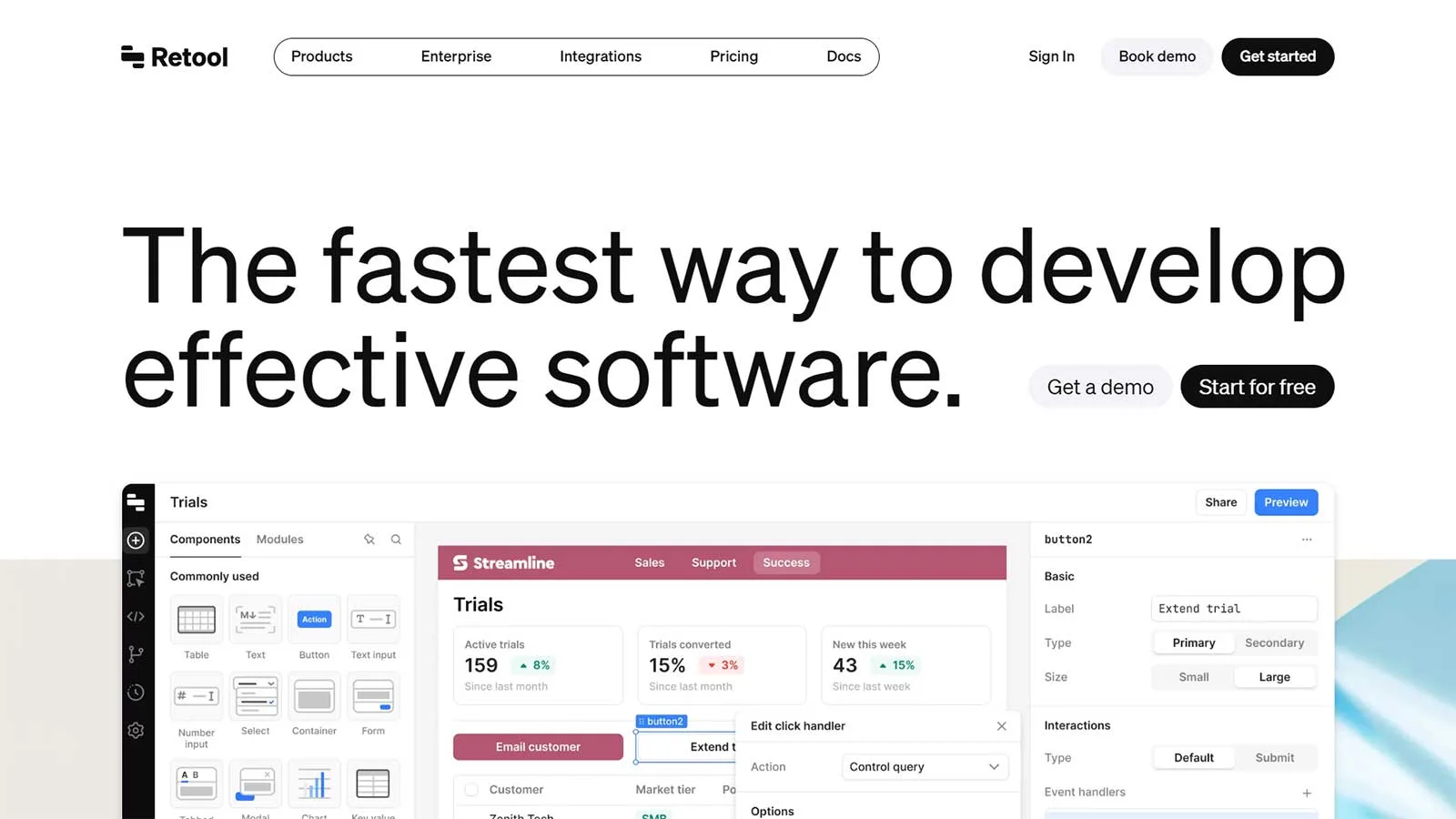
When it comes to constructing internal applications, Retool emerges as a superb choice. It alleviates the challenges associated with managing UI libraries, data sources, and access controls, providing a seamless solution to handle all aspects of application development.
With Retool, you’ll find a streamlined approach to managing these elements, resulting in the creation of user-friendly apps that customers will genuinely enjoy using.
Features:
- Saves effort and time: instead of finding the best React library for a component (say table), you can use Retool to get everything in a single place. It has options like drag and drop to enable you to arrange components and put together an application’s features and parts quickly.
- Robust building blocks: You will get 90+ useful and robust building blocks such as tables, charts, forms, lists, maps, wizards, and so on. Retool offers these components out of the box to help you spend more time assembling and optimizing your UI and not writing code for them separately.
- Visualization: Adding features like maps, tables, etc. to your applications allows users to visualize important data easily. This helps them take suitable actions even in crucial hours.
- Error handling: With Retool, you don’t need to worry about error handling from the backend. This tool can handle everything, from READing data from MongoDB and JOINing it to Postgres to POSTing its result directly to the Stripe API.
- Native API: You will get to use a native API in Retool to interact with queries and components via JS.
React Suite
React Suite encompasses a collection of component libraries tailored for enterprise system products. It offers robust support for all major browsers and platforms, including server-side rendering capabilities.
Familiarity with Less.js development ensures seamless customization of the components within React Suite. The library boasts an extensive array of components, including icons, loaders, dividers, tooltips, and more.
Features:
- Cross-Browser and Platform Support: React Suite ensures compatibility with all major browsers and platforms, ensuring a consistent user experience across different devices and environments. This includes support for server-side rendering, enabling developers to render React components on the server for improved performance and SEO.
- Comprehensive Component Libraries: React Suite provides a wide range of meticulously crafted components tailored for building enterprise-level applications. These components cover various aspects of UI development, including icons, loaders, dividers, tooltips, and more.
- Highly Starred on GitHub: With a significant number of stars on GitHub, React Suite enjoys widespread adoption and community support. This indicates its popularity among developers and underscores its reputation as a reliable choice for UI development.
- Active Maintenance and Support: React Suite boasts a dedicated team of maintainers who regularly update and enhance the library. This ensures that developers have access to the latest features, bug fixes, and improvements, providing a reliable foundation for building robust applications.
Visx
Developed by Airbnb, visx is a comprehensive assortment of expressive visualization primitives tailored for React applications. It serves to consolidate a cohesive visualization toolkit across Airbnb, amalgamating the user-friendly nature of React with the computational strength of D3.
By leveraging visx, you seamlessly integrate native experiences into any React-driven project, benefiting from consistent patterns and standardized APIs. This eradicates the need for repetitive copying and pasting of diverse React hooks. visx efficiently abstracts D3 intricacies, furnishing utilities and components in conventional formats.
Features:
- Lightweight: you can split visx into several packages and reduce the bundle size. Hence, you can start small, using only the components you need without having to use the entire library. This will also consume less time and space and you can complete your work faster.
- Utilities: visx offers SVG utilities to build interactive, complex SVGs. You will also get data utilities like mock data to help create visualizations. You can also create a chart of your own with utilities like tooltip and axis.
- Customization: visx allows you to easily customize your components. You can bring your animation library, state management, CSS-in-JS solution, etc., and start creating interesting UIs. This way, it becomes effortless for you to design your styling, theming, animation, etc.
- Multiple layouts: layouts included in it are heatmaps, networks, word clouds, stats, geographic projections, and more.
- Interactions: you can use primitives such as brush, zoom, drag, etc., to improve the user experience.
React Redux
React Redux, a UI component library overseen by Redux, undergoes regular updates to incorporate the latest APIs from React and Redux. Renowned for its predictability, intuitive interface, and precision, it excels in lighter projects rather than complex ones.
Features:
- Performance optimization: React Redux can automatically apply performance optimizations to enable the component to re-render during changing data needs.
- Encapsulated: You will get APIs to allow the components to interact directly with the Redux store. This prevents you from writing the code yourself.
- Straightforward interface: The tool has a straightforward interface to allow testing the code in several environments and comparing the result precisely.
- Predictability: This tool is designed to be compatible with the component model of React. Here, you can specify how to extract the required values for your components from Redux. Your component will also automatically update when something changes.
- Debugging: React Redux has DevTools that allow you to detect changes in the app state, log each change, and forward error reports. This enables a streamlined debugging process.
React Strap
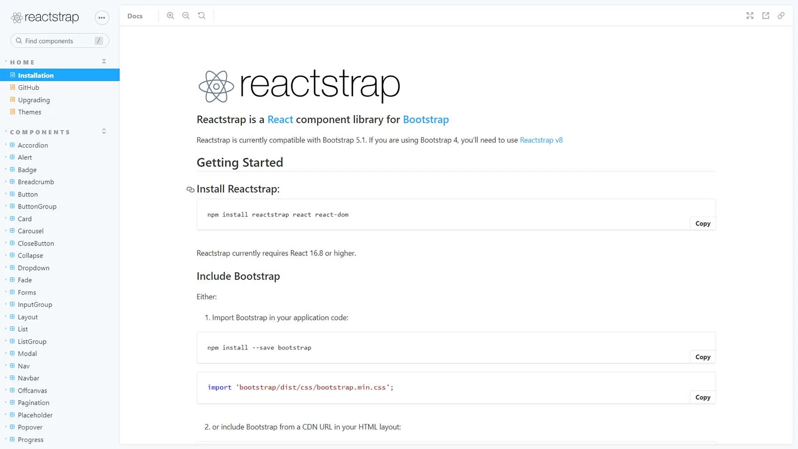
If you’re interested in straightforward React Bootstrap 4 components, consider Reactstrap. It offers two main distribution versions. The first is a stripped-down version, omitting optional dependencies for increased flexibility in setting up required dependencies.
The second version is the full package, encompassing all optional dependencies. This version is advisable for smaller applications. Reactstrap is another popular addition to the React UI components library, boasting over 10,000 stars on GitHub.
Features:
- Integration with React: React Bootstrap components are built using React.js, which means they can easily be integrated into React applications and take advantage of React’s component-based architecture and state management capabilities.
- Component Library: React Bootstrap provides a comprehensive library of pre-built components such as buttons, forms, navigation bars, modals, and more, allowing developers to quickly assemble user interfaces for their applications.
- Responsive Design: All React Bootstrap components are designed to be responsive, ensuring that applications adapt seamlessly to different screen sizes and devices, providing a consistent user experience across platforms.
- Customization: React Bootstrap allows developers to customize the appearance and behavior of components using CSS, Bootstrap’s utility classes, or by directly modifying component props and styles.
- Grid System: React Bootstrap includes a responsive grid system based on Bootstrap’s grid layout, allowing developers to create flexible and responsive layouts for their applications.
Belle
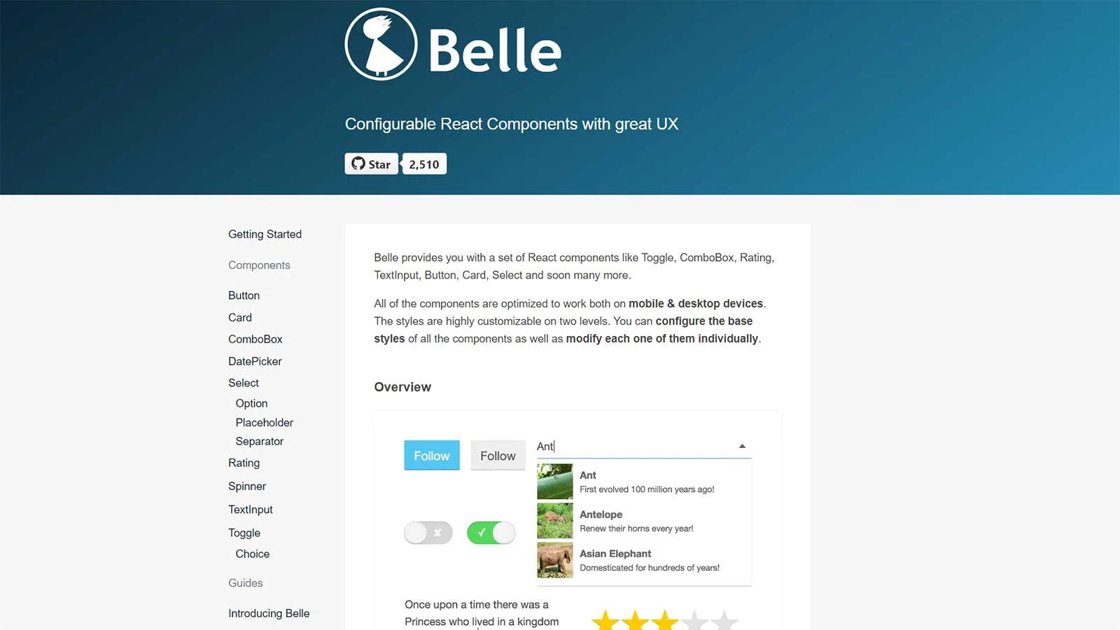
Belle offers a collection of React components including Toggle, ComboBox, Rating, TextInput, Button, Card, Select, and more on the way. These components are finely tuned to function seamlessly on both mobile and desktop devices.
With Belle, you have extensive styling customization options at your fingertips. You can adjust the base styles of all components and also fine-tune each component individually to suit your specific design needs.
Features:
- Highly Customizable Styling: Belle provides extensive styling customization options at two levels. Developers can configure the base styles of all components globally, and they can also modify individual components to tailor them to specific design requirements.
- Rich Component Collection: Belle offers a diverse set of pre-built React components, including Toggle, ComboBox, Rating, TextInput, Button, Card, Select, and more. These components cover a wide range of UI elements commonly used in web applications.
- Cross-Device Compatibility: All Belle components are optimized to work seamlessly across various devices and screen sizes, ensuring a consistent user experience whether accessed on desktop or mobile devices.
- Modular Architecture: Belle follows a modular architecture, enabling developers to easily integrate specific components into their projects without unnecessary dependencies or bloat.
- Responsive Design: Belle components are built with responsive design principles, allowing them to adapt and respond fluidly to different screen sizes and orientations.
Gestalt
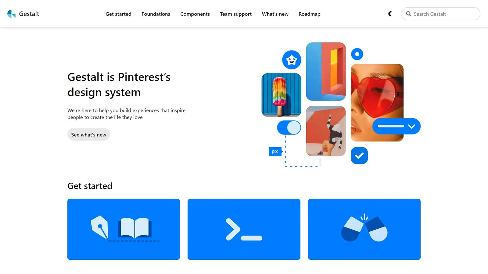
Gestalt stands as a UI library dedicated to crafting captivating user interfaces that resonate with users. Developed by Pinterest, it offers a plethora of features and components to streamline the design process. Its user-friendly interface ensures a seamless experience, enabling developers to swiftly dive into the tool and commence their projects.
Features:
- Foundations: While designing, you can play with elements such as color palettes, icons, typography, etc.
- Easy to adapt: Getting started with this tool is easy for designers by following their brand-new guide. They can also read how to configure the tool and pull requests.
- Components: You will get a comprehensive set of UI utilities and controls to create great user experiences.
React Motion
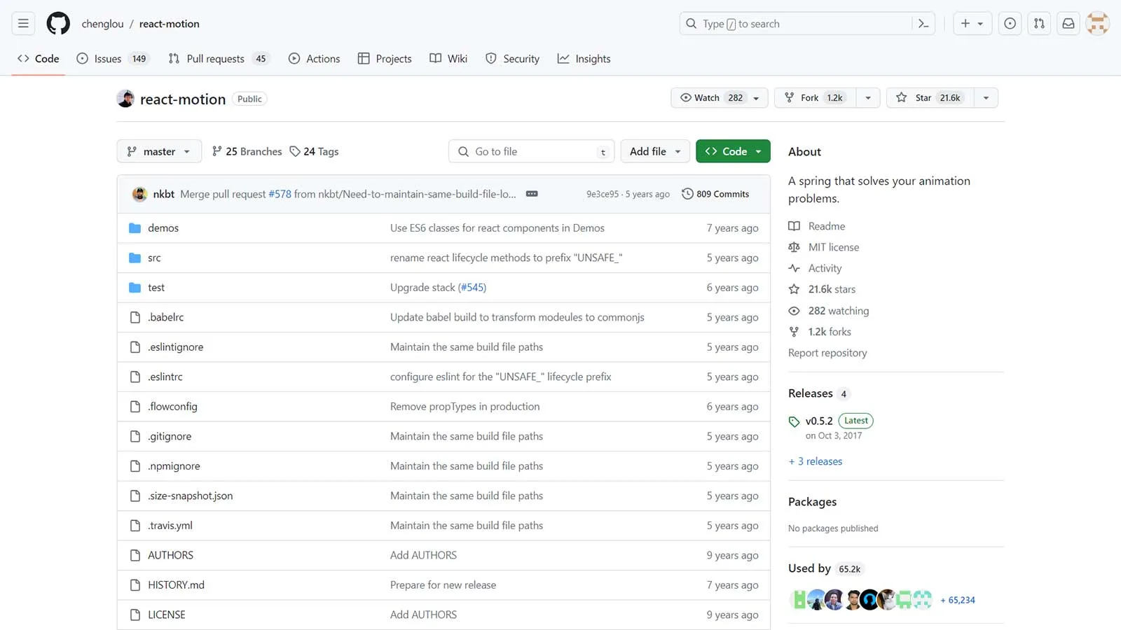
If you’re seeking a way to animate components within React, React Motion could be the solution for you. This impressive React library facilitates the creation of lifelike animations. Getting started with React Motion is straightforward and utilizing its features is a breeze.
Features:
- Performance Optimization: The library is designed for optimal performance, with efficient rendering and minimal overhead. React Motion uses requestAnimationFrame for smooth animation updates, and it automatically optimizes animations to minimize layout thrashing and unnecessary re-renders.
- Specifying stiffness values: The thing that makes this tool even more attractive is you can specify values for stiffness. You can also define damping parameters. This way, your components will look more realistic as you can control the stiffness.
- Compatibility: React Motion is compatible with both React and React Native, allowing developers to create animations for web and mobile applications using a single codebase. It also works well with other React libraries and frameworks, making it versatile and adaptable to different project requirements.
- Styling: You can use React Motion to easily animate a simple card component’s scaling. For this, you will need to utilize styled components.
React Desktop
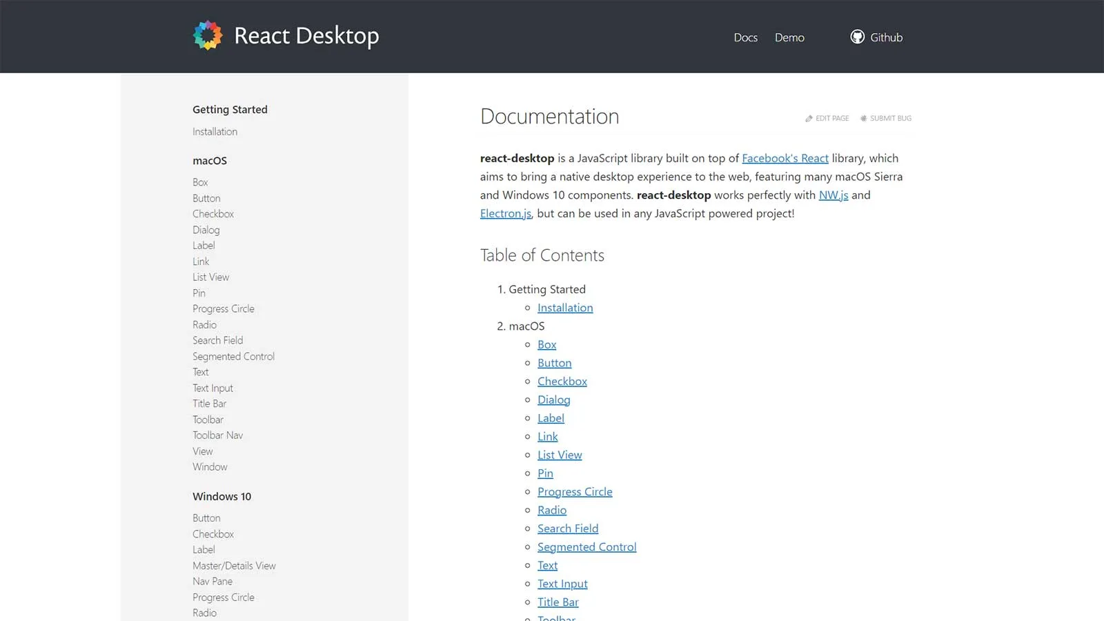
React Desktop is a widely embraced library that extends the capabilities of React.js, aiming to replicate the native desktop experience within web applications. This library serves as a cross-platform desktop development toolkit, offering components tailored for macOS and Windows operating systems.
Features:
- Rich Component Library: React Desktop comes with a rich set of pre-built components, including buttons, input fields, dropdowns, menus, toolbars, tabs, and more, enabling developers to quickly build sophisticated desktop interfaces.
- Native Look and Feel: React Desktop components are designed to mimic the appearance and behavior of native desktop applications, providing users with a familiar experience across different operating systems.
- Highly Customizable: React Desktop components are highly customizable, allowing developers to tweak various aspects of their appearance and behavior to suit the specific needs of their applications.
- Cross-Platform Compatibility: React Desktop components are built to work seamlessly across different desktop platforms, including Windows, macOS, and Linux, allowing developers to write once and deploy anywhere.
React component libraries play a vital role in streamlining the development process and improving the quality of React applications. By providing reusable, well-designed components, these libraries empower developers to build better user interfaces quickly. Whether working on a small project or a large-scale application, incorporating a React component library can unlock possibilities and elevate the overall development experience. With many options available, developers can choose the library that best fits their project requirements and development workflow, ultimately enabling them to deliver exceptional user experiences.
Bootstrap 5 Components
Bootstrap Login Forms, Bootstrap 5 Snippets, Bootstrap Cards, Bootstrap Carousels, Bootstrap Heroes, Bootstrap Footers
Related Posts
Browse our collection of related blog posts, where we delve deep into the fascinating design and development world. Whether you’re a seasoned enthusiast looking to expand your knowledge or a curious newcomer eager to learn more, this compilation of articles will serve as your guiding light.

