8 Best Bootstrap Alternatives
Bootstrap has long been a dominant force in front-end development, offering comprehensive tools and components for building responsive and visually appealing websites.
However, several alternative frameworks have emerged as the web development landscape evolves, providing developers with diverse options to create modern and customized interfaces.
Let’s delve into some of the top alternatives to Bootstrap that offer unique features and capabilities.
Best Ready to Use Web Themes & Templates
Bootstrap 5 Templates
Bootstrap One Page Templates, Bootstrap 5 Templates, Free Bootstrap Templates
Tailwind CSS
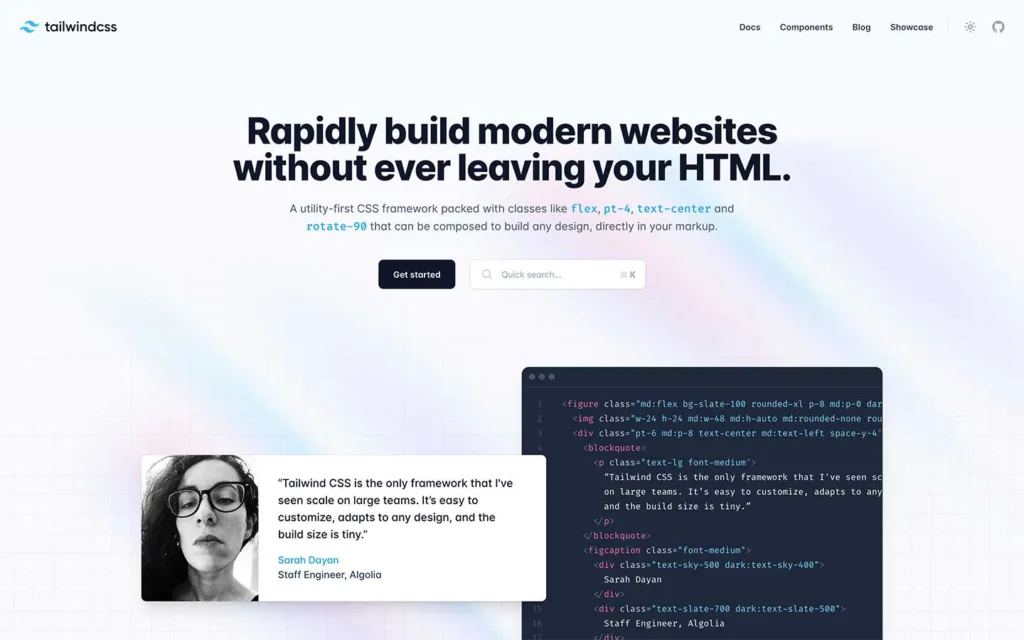
Tailwind CSS is a modern, utility-first CSS framework designed to expedite front-end development by providing a highly customizable set of utility classes.
It diverges from traditional CSS frameworks by offering a comprehensive library of small, single-purpose classes that a developer can apply within HTML elements to style components and build interfaces.
Core Principles and Approach
- Utility-First Philosophy: Tailwind’s approach centers on providing utility classes for specific CSS properties like margins, padding, typography, colors, and more. Developers can use these classes directly in HTML markup to rapidly style elements.
- Customizability: One of Tailwind’s strengths lies in its customization capabilities. It comes with a configuration file that allows developers to modify existing utility classes, add new ones, or completely redefine the design system to match project requirements.
- Responsive Design: Tailwind simplifies creating responsive designs by offering classes for breakpoints and responsive utilities. This approach makes adjusting styles for various screen sizes accessible without writing media queries.
Features and Functionality
- Modularity and Composition: Tailwind promotes a modular approach to styling, encouraging developers to compose designs by combining utility classes rather than writing custom CSS rules. This approach leads to more consistent, reusable, and scalable code.
- Developer Tooling: It integrates seamlessly with developer tools like PostCSS, PurgeCSS, and Webpack, providing efficient workflows for building and optimizing stylesheets.
- Theming and Plugins: Tailwind supports theming via its configuration file, allowing developers to create and use custom themes. Additionally, it has a vibrant ecosystem of plugins and extensions that extend its functionality and cater to specific needs.
Benefits and Advantages
- Productivity and Speed: Tailwind significantly accelerates the front-end development process by eliminating the need to write repetitive CSS code, resulting in faster prototyping and production.
- Consistency and Maintainability: The utility-first approach fosters character in design patterns throughout the project and eases maintenance by making styles more predictable and reusable.
- Community and Resources: It boasts an active community that contributes tutorials, guides, starter kits, and third-party integrations, making it easier for newcomers to learn and utilize Tailwind effectively.
Considerations and Challenges
- Learning Curve: Initially, developers might face a learning curve to adapt to the utility-first approach, especially if they’re accustomed to traditional CSS frameworks or methodologies.
- File Size and HTML Clutter: Depending on usage, the resulting HTML markup can become verbose with numerous utility classes, potentially increasing file size and making the code less readable to some developers.
Pricing
Tailwind CSS is open-source and free to use.
Semantic UI
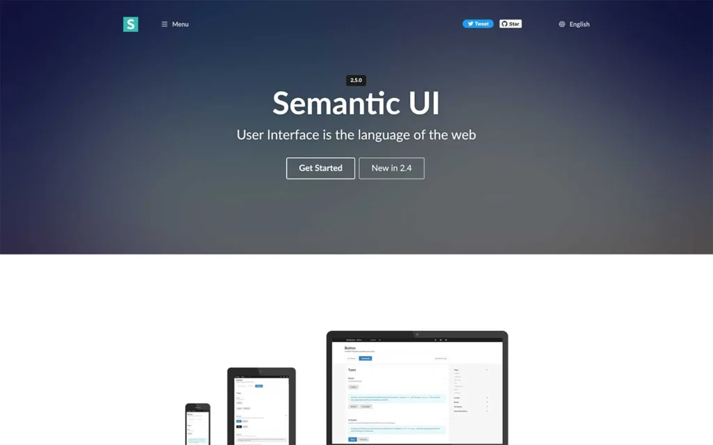
Semantic UI is a popular front-end development framework that focuses on creating responsive and visually appealing user interfaces using human-friendly HTML.
It offers various pre-designed UI components and utilities, providing a consistent and intuitive design language for web applications and websites.
Core Principles and Approach
- Semantic HTML: The framework promotes using semantic HTML elements to create clear and meaningful structures, aiding accessibility and search engine optimization (SEO).
- Component-Based Design: Semantic UI offers various pre-built UI components such as buttons, forms, menus, modals, and more. These components are easy to customize and extend.
- Responsive and Mobile-Friendly: It follows a responsive design approach, ensuring the features and layouts adapt seamlessly to different screen sizes and devices.
Features and Functionality
- Human Readable HTML: Semantic UI uses intuitive class names and semantic HTML tags, making it easier for developers to understand and use.
- Theming and Customization: It provides theming capabilities, allowing developers to customize the look and feel of components through variables, allowing for easy adaptation to specific design requirements.
- JavaScript Integration: Semantic UI comes with JavaScript components to enhance user interactions, such as dropdowns, modals, accordions, and more, providing interactive functionalities out of the box.
Benefits and Advantages
- Ease of Use: Semantic UI’s human-readable HTML and intuitive class names make it easy for developers to prototype and build interfaces quickly without extensive CSS knowledge.
- Consistency and Extensibility: The framework offers a consistent design language across components, ensuring a cohesive user experience. Additionally, developers can easily extend and customize features to suit specific project needs.
- Community and Resources: Semantic UI has an active community that contributes themes, plugins, extensions, and documentation, providing additional functionalities and support.
Considerations and Challenges
- File Size and Performance: Depending on usage, including all components might result in larger file sizes, impacting page load times. However, Semantic UI provides options to include details to mitigate this issue selectively.
- Learning Curve: While Semantic UI is user-friendly, developers new to the framework might require some time to familiarize themselves with its structure and best practices.
Pricing
Semantic UI is an open-source framework released under the MIT License. As such, it is free for personal and commercial projects. There are no direct licensing fees or costs associated with using Semantic UI. Users can access the framework, documentation, and source code without payment.
Bulma
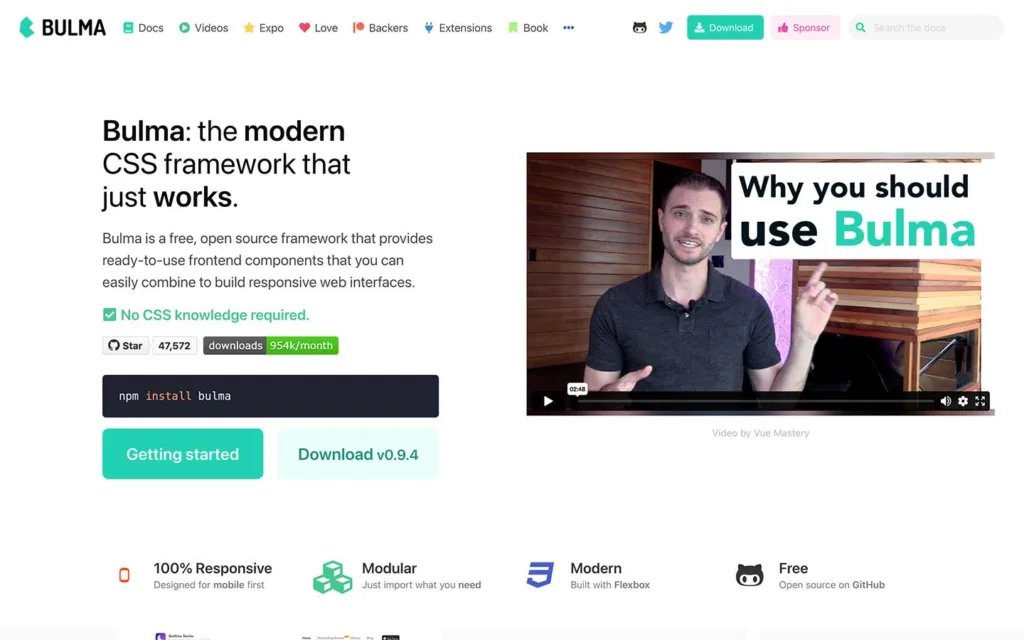
Bulma is a modern, open-source CSS framework based on Flexbox, designed to simplify and speed up the process of building responsive and attractive user interfaces.
It provides a comprehensive collection of ready-to-use components and layout options, enabling developers to create professional-looking websites and web applications quickly.
Core Principles and Approach
- Flexbox-Based Layout: Bulma is built entirely on Flexbox, offering a robust grid system and numerous Flexbox-based utilities. This technique makes it highly responsive and adaptable to different screen sizes and devices.
- Modularity and Component-Based Design: Bulma follows a modular approach, providing standalone and customizable components like navigation bars, cards, forms, modals, and more. These components can be easily integrated into projects, reducing development time and ensuring consistency in design.
- Simplicity and Ease of Use: With a clean and intuitive syntax, Bulma aims to simplify the development process by providing straightforward class names for styling elements. This practice makes it accessible to developers of varying skill levels.
Features and Functionality
- Responsive Design: Bulma includes a mobile-first, responsive grid system that automatically adjusts layouts for different viewport sizes, ensuring a consistent user experience across devices.
- Customizability: While Bulma comes with a predefined set of styles, it allows customization through variables and modifiers, enabling developers to tailor the look and feel to suit specific project requirements.
- Extensibility: Like other CSS frameworks, Bulma offers an ecosystem of extensions, themes, and community-contributed resources that extend its functionality and cater to diverse project needs.
Benefits and Advantages
- Saves Development Time: Bulma accelerates the development process by providing a collection of pre-designed components and a flexible grid system, especially for prototyping and creating quick mockups.
- Responsive and Mobile-Friendly: Its mobile-first approach and built-in responsive design features ensure that websites or applications built with Bulma are well-optimized for various devices and screen sizes.
- Documentation and Community Support: Bulma is well-documented, with comprehensive guides and examples, and has an active community that contributes resources, tutorials, and support.
Considerations and Challenges
- Learning Curve: While Bulma’s simplicity makes it relatively easy to start using, there might still be a learning curve, especially for developers new to CSS frameworks or Flexbox.
- Limited Browser Support: Some older browsers may not fully support Flexbox, which could affect Bulma’s layout and functionality in those cases. However, this is becoming less of an issue as browser support for Flexbox improves over time.
Pricing
Bulma is an open-source project, so it is entirely free to use.
Materialize
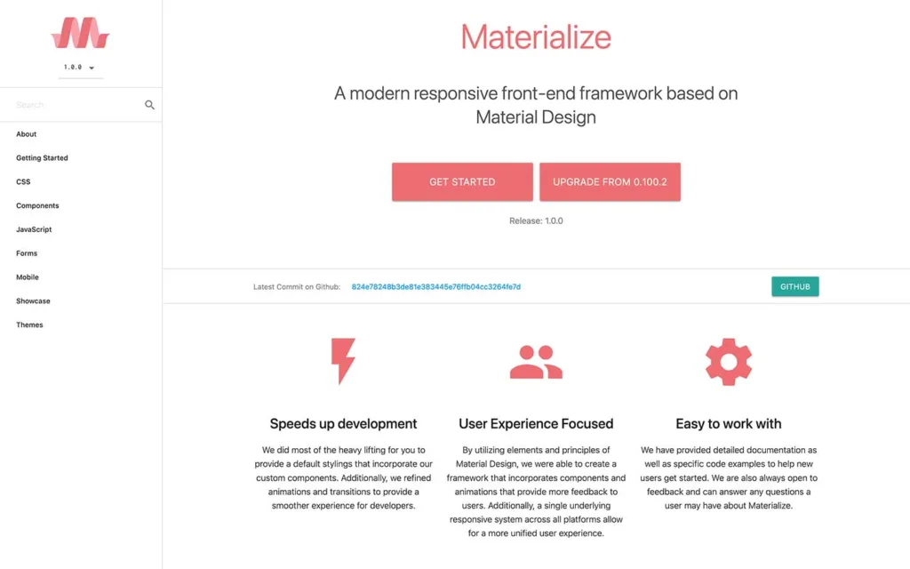
Materialize is a modern front-end framework that implements Google’s Material Design principles to create visually appealing, responsive, and user-friendly websites and web applications.
It provides a comprehensive set of pre-designed components, CSS classes, and JavaScript functionalities, making it easier for developers to build consistent and polished interfaces.
Core Principles and Approach
- Material Design Guidelines: Materialize adheres to Google’s Material Design philosophy, which emphasizes clean, intuitive, and consistent user interfaces with depth, motion, and visual cues.
- Ready-to-Use Components: Materialize offers a wide range of components such as cards, buttons, forms, navigation bars, modals, and more, all designed following Material Design principles. These components are easy to implement and customizable.
- Mobile-First and Responsive: The framework is designed with a mobile-first approach, ensuring that websites and applications built with Materialize are responsive and function well on various devices and screen sizes.
Features and Functionality
- CSS Flexibility: Materialize provides a robust grid system and utility classes based on Flexbox, enabling developers to create flexible and responsive layouts effortlessly.
- JavaScript Components: Along with CSS, Materialize includes JavaScript components for enhanced functionalities like modals, dropdowns, carousels, tabs, and more, making interactive elements easier to implement.
- SASS Support: Materialize can be customized and extended using SASS (Syntactically Awesome Style Sheets), offering variables, mixins, and other features to modify and streamline the CSS code.
Benefits and Advantages
- Material Design Aesthetics: By following Material Design principles, Materialize helps developers create visually appealing and consistent UIs that align with modern design trends.
- Ease of Use: The framework’s pre-styled components and intuitive class names make it relatively easy for developers to prototype and build applications quickly without extensive CSS knowledge.
- Community and Resources: Materialize has an active community that contributes to plugins, themes, extensions, and resources, offering additional functionalities and support for users.
Considerations and Challenges
- Learning Curve: While Materialize provides comprehensive documentation, developers new to Material Design concepts may need time to understand and fully utilize the framework’s features.
- Performance Consideration: Using a full-fledged framework like Materialize might result in larger file sizes, impacting page load times, especially if not optimized properly.
- Customization Limitations: While Materialize offers customization options, there might be limitations when diverting significantly from the default Material Design styles without extensive custom coding.
Pricing
Materialize CSS is an open-source framework that is freely available for anyone to use. It is licensed under the MIT License, allowing users to use, modify, and distribute the framework without cost. No licensing fees are associated with using Materialize CSS in personal or commercial projects.
Foundation
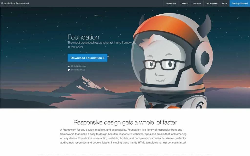
Foundation is an open-source responsive front-end framework developed by ZURB, designed to help developers build responsive websites and web applications quickly and efficiently.
It offers a robust set of pre-styled components, a flexible grid system, and a plethora of tools that aid in creating modern and mobile-friendly interfaces.
Core Principles and Approach
- Responsive Design: The Foundation is built with a mobile-first approach, ensuring that websites and applications are responsive and perform well across various devices and screen sizes.
- Modularity and Customizability: It emphasizes modularity, allowing developers to pick and choose specific components or features to include in their projects. The Foundation also provides customization options through SASS variables, enabling developers to tailor the framework to their design needs.
- Accessibility and Compatibility: The Foundation strongly emphasizes accessibility, striving to create designs and components that are usable by people of all abilities. It is also compatible with various browsers and devices.
Features and Functionality
- Flexibility and Grid System: The Foundation offers a robust, responsive grid system, allowing developers to create complex layouts easily. It provides a range of layout options and classes for creating adaptive designs.
- Component Library: It includes a comprehensive set of pre-designed components such as navigation bars, buttons, forms, modals, and more, aiding in the rapid development of consistent and polished interfaces.
- SASS Integration: The Foundation utilizes SASS (Syntactically Awesome Style Sheets) to enable easier customization and extension of styles through variables, mixins, and other SASS features.
Benefits and Advantages
- Performance and Speed: The Foundation’s lightweight nature and optimized CSS and JavaScript contribute to faster loading times, improving overall performance.
- Community Support and Resources: It has an active community that provides support, themes, plugins, and extensions, enhancing the framework’s functionality and aiding developers in their projects.
- Learning Resources: The Foundation offers comprehensive documentation, guides, and tutorials that help users understand the framework’s features and best practices for implementation.
Considerations and Challenges
- Learning Curve: Developers new to Foundation or responsive design principles might need some time to become proficient in using the framework effectively.
- Customization Complexity: While Foundation offers customization options, extensively modifying the framework might require a deeper understanding of its architecture and SASS customization.
Pricing
The Foundation is available under the MIT License, making it accessible for personal and commercial projects. No licensing fees or costs are associated with using the Foundation framework. Users can access the framework, documentation, and source code without payment.
Pure CSS
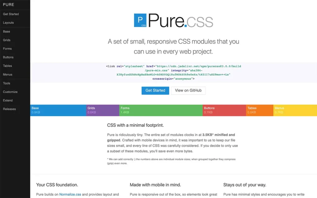
Pure is a lightweight and minimalistic CSS framework developed by Yahoo! that aims to provide a simple and responsive foundation for creating clean and fast websites.
Pure is designed to be small and easy to use, offering a set of modules for creating basic styles and layouts without including extra components or JavaScript.
Core Principles and Approach
- Lightweight and Minimalistic: Pure focuses on simplicity and performance by providing a minimalistic set of styles and components. It emphasizes smaller file sizes and faster loading times.
- Responsive and Mobile-First: It follows a mobile-first approach, ensuring that websites created with Pure are responsive and adaptable to various screen sizes and devices.
- Modularity and Customization: Pure adopts a modular system with independent modules for grids, buttons, forms, and more. It allows developers to include and customize specific modules according to their requirements easily.
Features and Functionality
- Responsive Grid System: Pure includes a responsive grid system that helps create flexible and responsive layouts for different screen sizes.
- Base Styles: It offers basic styles for common elements like typography, forms, buttons, and tables, providing a clean and consistent look across different components.
- Minimalistic Design: Pure’s philosophy centers on simplicity and minimalism, allowing developers to focus on their design preferences without unnecessary styles or features.
Benefits and Advantages
- Lightweight and Fast: Pure’s minimalistic approach results in smaller file sizes and faster loading times, making it suitable for projects prioritizing performance.
- Ease of Use: Pure is easy to understand and use due to its simplicity and straightforwardness, especially for developers looking for a simple starting point without unnecessary bloat.
- Community and Support: While less extensive than some other frameworks, Pure has an active community that provides support and resources, including themes, extensions, and additional components.
Considerations and Challenges
- Limited Components: Pure focuses on providing basic styles and components, so developers looking for a comprehensive set of pre-designed elements may need more.
- Customization Complexity: While Pure allows customization, modifying its default styles might require a deeper understanding of CSS and be more complex than in more extensive frameworks.
Pricing
Pure is an open-source project released under the BSD License. As a result, it is free to use for personal and commercial purposes. There are no licensing fees or costs associated with the Pure CSS framework. Users can access the framework, documentation, and source code without payment.
UIkit
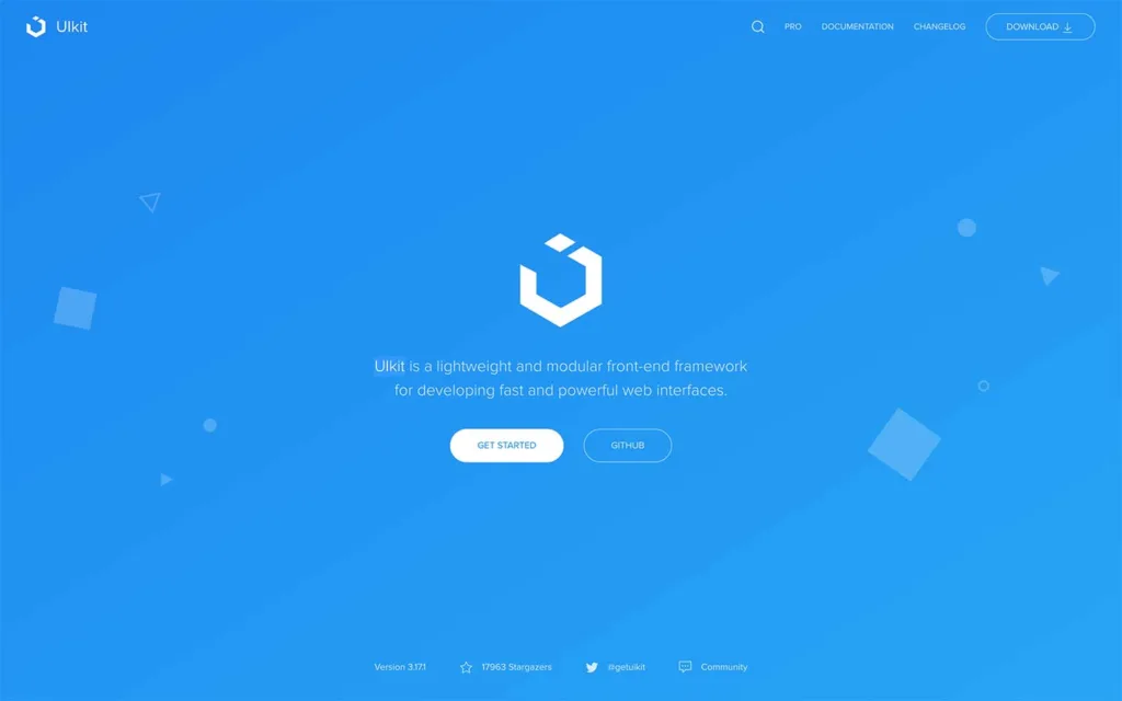
UIkit is a lightweight and modular front-end framework that provides a comprehensive collection of pre-designed components, CSS styles, and JavaScript functionalities to facilitate the development of modern and responsive web interfaces.
Core Principles and Approach
- Modularity and Lightweight: UIkit follows a modular approach, allowing developers to pick and choose specific components or features to include in their projects. It aims to keep the framework lightweight while providing rich functionalities.
- Responsive and Mobile-First: The framework is built with a mobile-first approach, ensuring that websites and applications created with UIkit are responsive and optimized for various screen sizes and devices.
- Customizability and Theming: UIkit provides extensive customization options through SASS variables and a theme system, allowing developers to easily modify styles and tailor the look and feel of components to match specific design requirements.
Features and Functionality
- Component Library: UIkit offers various pre-designed and customizable components such as navigation bars, grids, modals, sliders, forms, and more. These components are easy to integrate and style according to project needs.
- Responsive Grid System: It includes a responsive and flexible grid system that facilitates the creation of complex and adaptive layouts for different viewport sizes.
- JavaScript Components: UIkit comes with JavaScript-based components and interactions, including toggles, modals, sliders, and more, to enhance user experience and interactivity.
Benefits and Advantages
- Ease of Use and Learning Curve: UIkit is known for its user-friendly syntax and intuitive class names, making it relatively easy for developers to learn and use, especially for those new to CSS frameworks.
- Modularity and Customization: The modular nature of the UIkit allows for easy inclusion and customization of components, giving developers greater flexibility in building and styling interfaces.
- Documentation and Support: UIkit offers comprehensive documentation, guides, and examples, along with an active community that provides support, themes, extensions, and additional resources.
Considerations and Challenges
- Limited Advanced Components: Unlike other frameworks, UIkit may have a more limited range of advanced components, requiring additional customization or integration of third-party plugins for specific functionalities.
- Community and Ecosystem: While UIkit has an active community, the ecosystem of themes, plugins, and resources might not be as extensive as some larger frameworks.
Pricing
UIkit is an open-source framework released under the MIT License, which means it is free to use for both personal and commercial projects. There are no direct costs or licensing fees associated with using UIkit. Users can freely access the framework, documentation, and source code without any payment.
Material UI
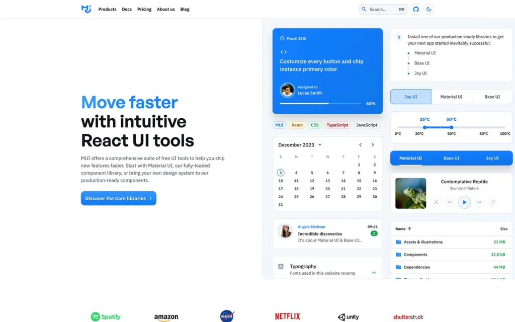
Material-UI is a prominent open-source React UI library that aligns with the abbreviation “MUI” and follows Google’s Material Design guidelines. It offers a vast collection of pre-built and customizable React components for building modern, responsive, and visually appealing web applications.
Core Principles and Approach
- React Components: Material-UI provides a rich set of React components designed following Material Design principles, including buttons, cards, forms, navigation bars, dialogs, and more.
- Customization: It offers extensive theming and customization options using the Material-UI theme system, allowing developers to modify styles, colors, and typography to suit specific design requirements.
- Responsive Design: Material-UI components are inherently responsive, ensuring that applications built with Material-UI adapt seamlessly across various devices and screen sizes.
- Accessibility: Material-UI prioritizes accessibility standards, ensuring its features are usable and navigable for users with disabilities, adhering to inclusive design practices.
- Community Support: Material-UI benefits from a large and active community that contributes themes, extensions, documentation, and resources, providing additional functionalities and support.
Features and Functionality
- Web Applications: Material-UI is used to develop various web application types, including dashboards, admin panels, e-commerce platforms, and data-driven applications.
- React Developers: It is popular among React developers seeking to create applications with a modern and consistent visual style following Material Design guidelines.
Considerations and Challenges
- Learning Curve: New developers might face a learning curve when using Material-UI effectively, especially if they are new to React or Material Design concepts.
- Bundle Size: Including all components might result in larger file sizes, so optimizing bundles might be necessary for improved performance.
Pricing
Material-UI is free to use and licensed under the MIT License. No direct costs or licensing fees are associated with using Material-UI for personal or commercial projects.
Bootstrap 5 Components
Bootstrap Login Forms, Bootstrap 5 Snippets, Bootstrap Cards, Bootstrap Carousels, Bootstrap Heroes, Bootstrap Footers
Related Posts
Browse our collection of related blog posts, where we delve deep into the fascinating design and development world. Whether you’re a seasoned enthusiast looking to expand your knowledge or a curious newcomer eager to learn more, this compilation of articles will serve as your guiding light.


