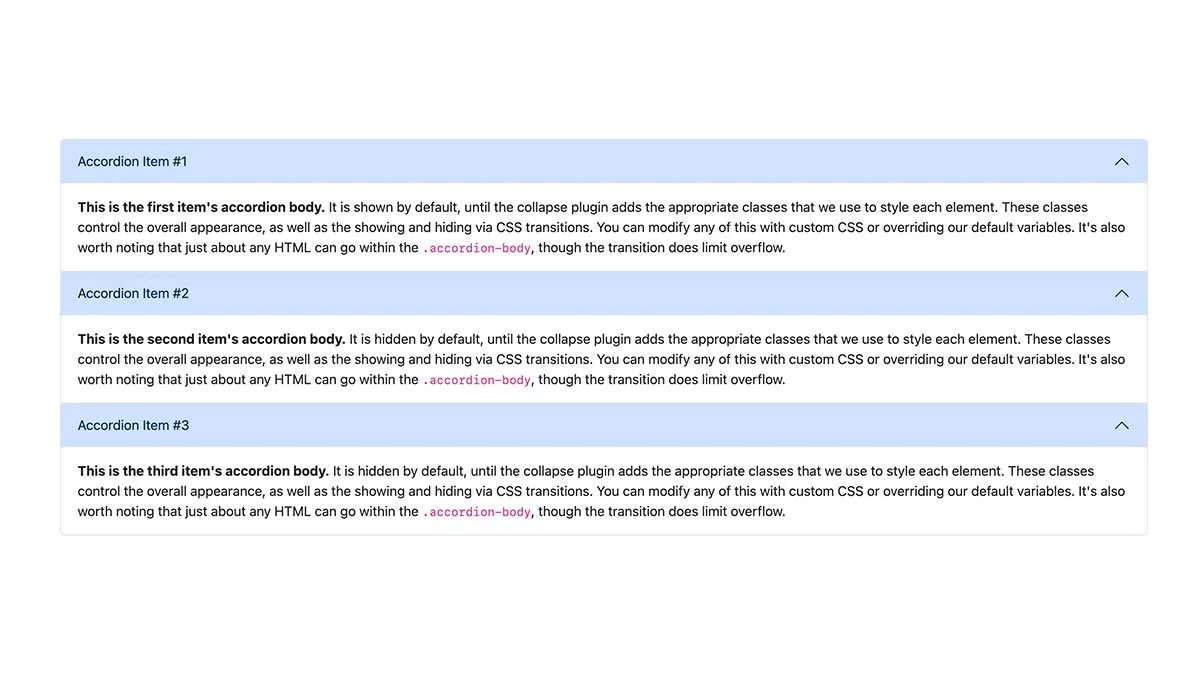
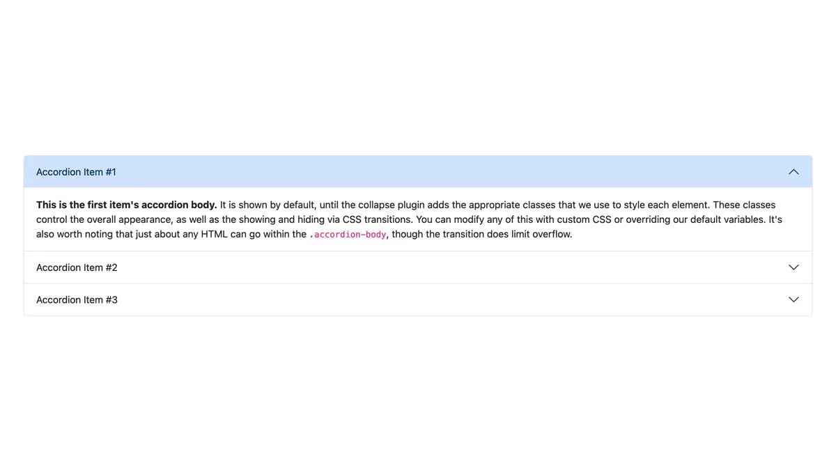
Bootstrap 5 Accordion Header Icon
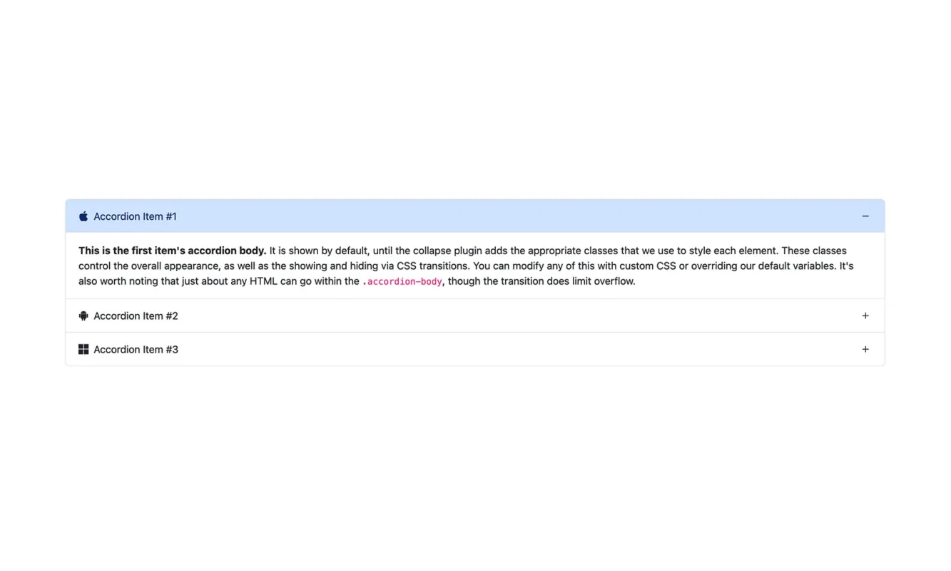
Adding icons in the Bootstrap Accordion Header makes it elegant, modern, and sleek. Luckily, adding icons is straightforward by using the icon fonts stylesheet.
Bootstrap 5 Tutorial Update
We have updated this Bootstrap tutorial to Bootstrap 5.3.3 and BSB Framework 2.0.4. We have rechecked this Bootstrap example on May 3, 2024.
Best Ready to Use Web Themes & Templates
Bootstrap 5 Accordion Header Icon
We have used Bootstrap Icons to add icons in the Bootstrap Accordion Header. You can use any other icon fonts of your choice. The steps of adding an icon in the Bootstrap Accordion Header will be nearly the same.
Bootstrap 5 Templates
Bootstrap One Page Templates, Bootstrap 5 Templates, Free Bootstrap Templates
In the first step, you will link the Bootstrap Icons stylesheet in the <head>. In the second step, you add an icon using the following snippet.
<i class="bi-info-circle"></i>You can check the demo to comprehend the idea. Bootstrap Icons library has free, high quality with over 2,000 open-source icons.
Features
- Bootstrap 5
- BSB Framework
- Accordion Header Icon
- Bootstrap Icons
- HTML5 & CSS3
- W3C Valid
- Commented Code
- Responsive Layout
- Easy to Use
- Cross Browser Compatible
Tags
Bootstrap 5 Components
Bootstrap Login Forms, Bootstrap 5 Snippets, Bootstrap Cards, Bootstrap Carousels, Bootstrap Heroes, Bootstrap Footers
Preview
<!-- Accordion 5 - Bootstrap Brain Component -->
<section class="py-3 py-md-5 bg-light">
<div class="container">
<div class="row">
<div class="col-12">
<div class="accordion accordion-flush" id="accordionFlushExample">
<div class="accordion-item">
<h2 class="accordion-header">
<button class="accordion-button" type="button" data-bs-toggle="collapse" data-bs-target="#flush-collapseOne" aria-expanded="true" aria-controls="flush-collapseOne">
<i class="bi-info-circle me-2"></i>
Accordion Item #1
</button>
</h2>
<div id="flush-collapseOne" class="accordion-collapse collapse show" data-bs-parent="#accordionFlushExample">
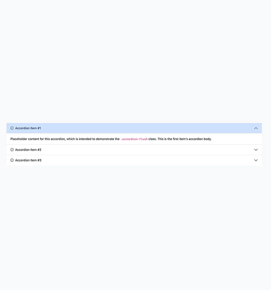
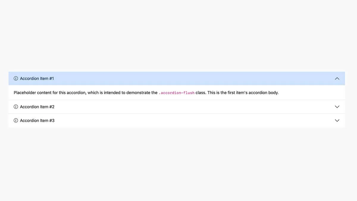
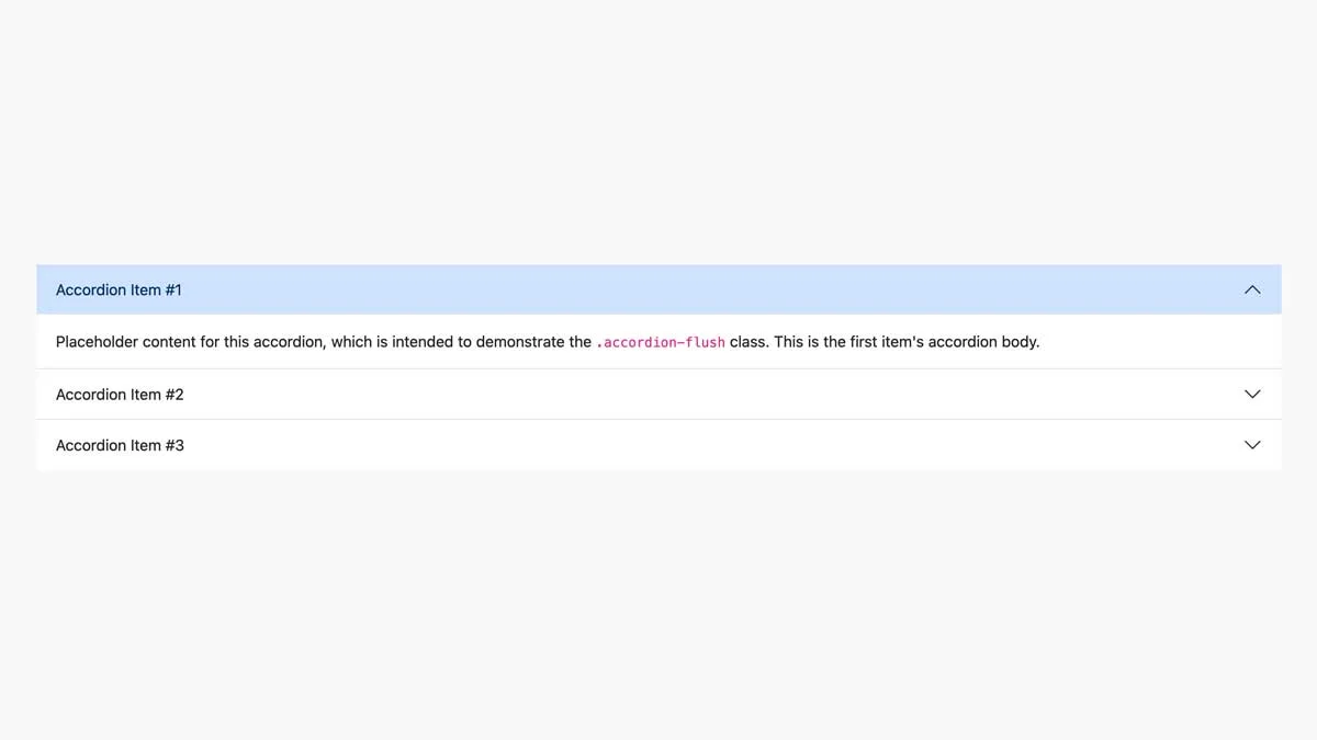
<div class="accordion-body">Placeholder content for this accordion, which is intended to demonstrate the <code>.accordion-flush</code> class. This is the first item's accordion body.</div>
</div>
</div>
<div class="accordion-item">
<h2 class="accordion-header">
<button class="accordion-button collapsed" type="button" data-bs-toggle="collapse" data-bs-target="#flush-collapseTwo" aria-expanded="false" aria-controls="flush-collapseTwo">
<i class="bi-info-circle me-2"></i>
Accordion Item #2
</button>
</h2>
<div id="flush-collapseTwo" class="accordion-collapse collapse" data-bs-parent="#accordionFlushExample">
<div class="accordion-body">Placeholder content for this accordion, which is intended to demonstrate the <code>.accordion-flush</code> class. This is the second item's accordion body. Let's imagine this being filled with some actual content.</div>
</div>
</div>
<div class="accordion-item">
<h2 class="accordion-header">
<button class="accordion-button collapsed" type="button" data-bs-toggle="collapse" data-bs-target="#flush-collapseThree" aria-expanded="false" aria-controls="flush-collapseThree">
<i class="bi-info-circle me-2"></i>
Accordion Item #3
</button>
</h2>
<div id="flush-collapseThree" class="accordion-collapse collapse" data-bs-parent="#accordionFlushExample">
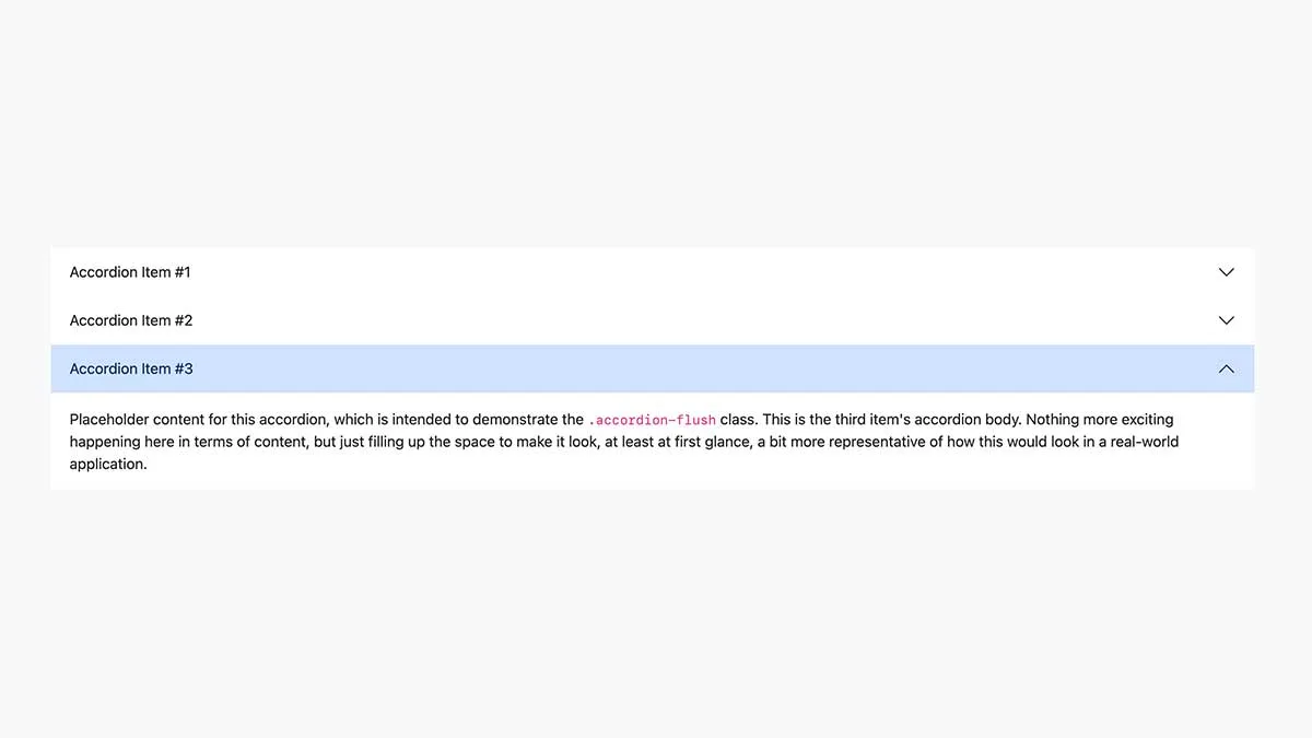
<div class="accordion-body">Placeholder content for this accordion, which is intended to demonstrate the <code>.accordion-flush</code> class. This is the third item's accordion body. Nothing more exciting happening here in terms of content, but just filling up the space to make it look, at least at first glance, a bit more representative of how this would look in a real-world application.</div>
</div>
</div>
</div>
</div>
</div>
</div>
</section><link rel="stylesheet" href="https://unpkg.com/[email protected]/dist/css/bootstrap.min.css">
<link rel="stylesheet" href="https://cdn.jsdelivr.net/npm/[email protected]/font/bootstrap-icons.css"><script src="https://unpkg.com/[email protected]/dist/js/bootstrap.bundle.min.js"></script>Bootstrap 5 Accordion Examples
Browse our best free Bootstrap Accordion tutorials and examples. These Bootstrap Accordion examples have a variety of layouts and designs. Extending these Bootstrap Accordion examples to fit into your Bootstrap projects is very easy.
- Use in personal projects
- Customize the template files
- Number of websites/domains
- Create websites for clients
- Remove footer credit link
- Working PHP/AJAX contact form
- Sass/SCSS Files
- JS Source Files
- Premium support via Email
- Forum support
- Free Updates
- Access to all 8 Pro Templates
- Access to all 51 Pro Components
- Use in SaaS
- Resell & Redistribute
BB Startup
Freelancer
$49
3 Months Access
8 Pro BS Templates
51 Pro BS Components
- Use in personal projects
- Customize the template files
- Unlimited Number of websites/domains
- Create websites for clients
- Remove footer credit link
- Working PHP/AJAX contact form
- Sass/SCSS Files
- JS Source Files
- Premium support via Email
- Forum support
- 3 Months Free Updates
- Access to all our 8 Pro Templates
- Access to all our 51 Pro Components
-
Use in SaaS -
Resell & Redistribute
BB Club
Agency
$149
12 Months Access
8 Pro BS Templates
51 Pro BS Components
- Use in personal projects
- Customize the template files
- Unlimited Number of websites/domains
- Create websites for clients
- Remove footer credit link
- Working PHP/AJAX contact form
- Sass/SCSS Files
- JS Source Files
- Premium support via Email
- Forum support
- 12 Months Free Updates
- Access to all our 8 Pro Templates
- Access to all our 51 Pro Components
- Use in SaaS
-
Resell & Redistribute