15 Best Vue UI Component Libraries 2024
Creating visually appealing and user-friendly interfaces is paramount in the ever-evolving landscape of web development. Among Javascript Frameworks, Vue has gained immense popularity for building modern, reactive user interfaces.
Best Ready to Use Web Themes & Templates
Bootstrap 5 Templates
Bootstrap One Page Templates, Bootstrap 5 Templates, Free Bootstrap Templates
Vue has emerged as a powerhouse for creating interactive and responsive user interfaces. To turbocharge the development process, many developers turn to UI component libraries. These libraries provide a treasure trove of pre-built components that save time and ensure consistency and a polished look. This post explores the best Vue UI component libraries and their features.
Ant Design Vue
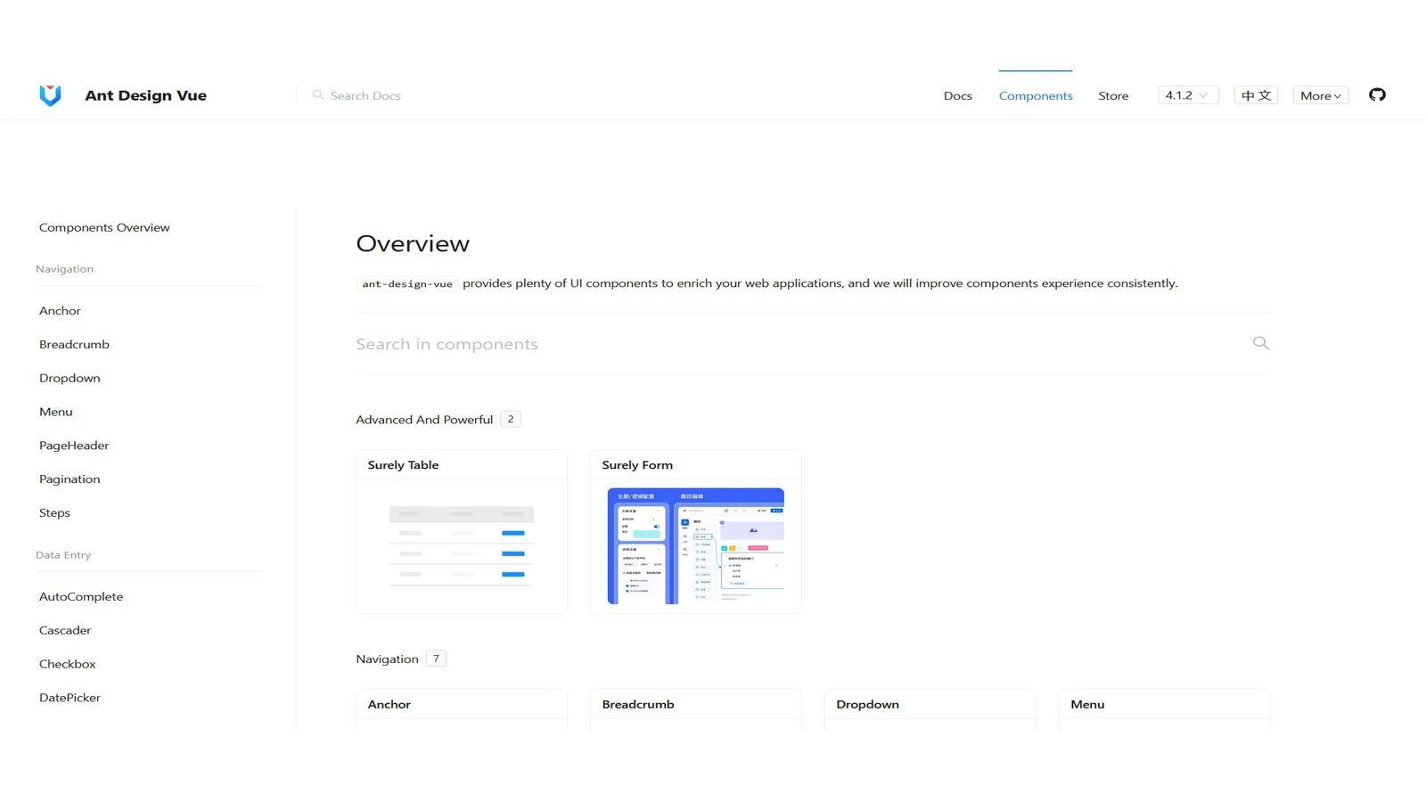
Ant Design Vue is a Vue.js implementation of the Ant Design System, a design language developed by Alibaba Group. It brings a set of high-quality, reusable UI components that adhere to the principles of design consistency, accessibility, and efficiency. By leveraging Ant Design Vue, developers can streamline the UI development process and create visually stunning and responsive applications.
- Rich Set of Components: Ant Design Vue provides various components, including buttons, forms, navigation menus, modals, and more. These components are designed to be modular and can be easily integrated into Vue.js applications, saving developers valuable time and effort.
- Consistent Design Language: One of the standout features of Ant Design Vue is its adherence to a consistent design language. This uniform design language ensures that UI elements across different components maintain a unified look and feel, contributing to a cohesive and professional user interface.
- Customization Options: While Ant Design Vue offers a default set of styles, it also provides extensive customization options. Developers can easily modify the components’ appearance to match their projects’ branding and design requirements, ensuring flexibility without sacrificing consistency.
- Accessibility and Internationalization: Ant Design Vue is committed to accessibility, making sure that UI components are usable by individuals with disabilities. It also offers internationalization support, allowing developers to create applications catering to a global audience.
AT UI
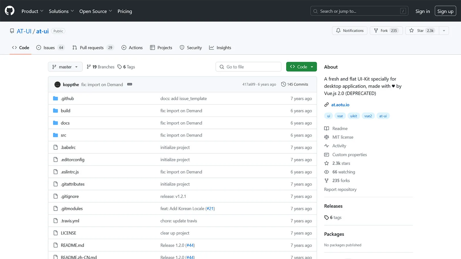
AT UI is a Vue front-end UI framework that stands out for its modular approach to building user interfaces. Developed to provide developers with a toolkit for creating modern, responsive, and modular web applications, AT UI has gained popularity for its simplicity, efficiency, and extensive customization capabilities.
- Modular Architecture: AT UI embraces a modular design philosophy, allowing developers to pick and choose the components they need for their projects. This modular approach not only reduces the overall size of the application but also enhances maintainability and scalability.
- Extensive Component Library: The framework boasts an extensive library of components, ranging from essential elements like buttons and forms to more complex structures such as models, data tables, and charts. Each component is crafted with attention to detail, ensuring consistency and usability across the application.
- Customization and Theming: AT UI understands the importance of branding and design coherence. With a flexible theming system, developers can easily customize the appearance of components to align with the visual identity of their projects. This level of customization ensures a unique and branded user experience.
- Responsive Design: In the era of diverse device usage, responsive design is paramount. AT UI components are built with responsiveness, ensuring a seamless user experience across various screen sizes and devices.
BootstrapVue
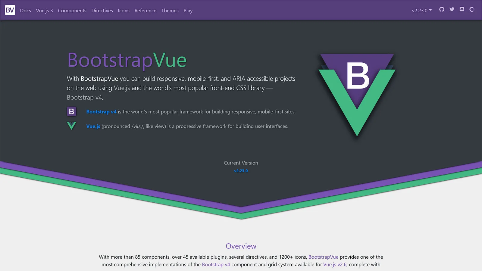
BootstrapVue is a library that brings the power and versatility of Bootstrap, a widely acclaimed HTML, CSS, and JavaScript framework, to Vue applications. By providing Vue components compatible with Bootstrap’s styling and functionality, BootstrapVue enables developers to quickly build responsive, feature-rich web applications.
- Vue.js Components Aligned with Bootstrap: BootstrapVue offers Vue components that integrate seamlessly with Bootstrap’s styling and layout. These Vue components include various elements such as navigation bars, modals, buttons, forms, and more, allowing developers to leverage Bootstrap’s design language within their Vue.js applications.
- Responsive Design: With BootstrapVue, creating responsive web applications becomes straightforward. The responsive grid system and utility classes from Bootstrap can be seamlessly incorporated into Vue components, ensuring a consistent and visually appealing experience across various devices and screen sizes.
- Extensive Component Library: BootstrapVue extends Bootstrap’s extensive component library with Vue-specific syntax and functionality. This combination provides developers with rich UI elements familiar to Bootstrap users and seamlessly integrated into Vue.js applications.
- Customization Options: While BootstrapVue provides ready-to-use components, it also understands the importance of customization. Developers can easily tweak and extend the styling and behavior of components to suit the specific design requirements of their projects.
Buefy
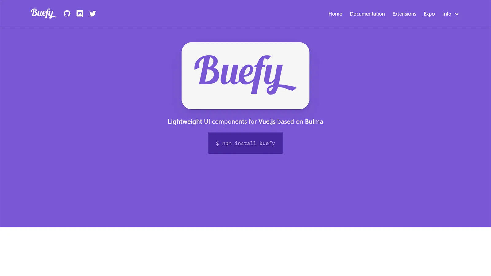
Buefy is a Vue UI component library inspired by Bulma, a modern CSS framework. This unique blend allows developers to harness the simplicity and beauty of Bulma’s styles while seamlessly integrating Vue.js components into their applications. Buefy aims to provide a lightweight yet powerful toolkit for Vue developers who appreciate clean and responsive design.
- Bulma Styling Integration: Buefy inherits Bulma’s clean and modern styling, ensuring a visually appealing and consistent look throughout the application. Developers familiar with Bulma will feel right at home, while those new to it can quickly embrace its intuitive and elegant design principles.
- Responsive and Mobile-Friendly: Buefy follows Bulma’s mobile-first philosophy, making it inherently responsive and mobile-friendly. Applications built with Buefy automatically adapt to different screen sizes, providing users a seamless experience across devices.
- Rich Set of Vue.js Components: Buefy offers a comprehensive collection of Vue.js components, ranging from essential elements like buttons and forms to more complex components such as modals, tabs, and notifications. Each component is versatile, customizable, and easily integrated into Vue.js applications.
- Lightweight and Modular: Buefy prides itself on being lightweight and modular. Developers can include only the components they need, minimizing the overall footprint of the library. This modular approach promotes efficiency and allows for greater flexibility in building custom-tailored interfaces.
Element Plus

Element Plus is a Vue component library based on the popular Element UI library. It inherits the strengths of Element UI while introducing improvements and optimizations to enhance the Vue development workflow. Element Plus offers a comprehensive collection of UI components that cover everything from essential elements to advanced components, making it a versatile choice for developers aiming to build modern and responsive applications.
- Extensive Component Library: Element Plus provides various Vue.js components, from essential elements like buttons and forms to complex components such as data tables, dialogs, and charts. This extensive library caters to the diverse needs of developers, ensuring a consistent and feature-rich user interface.
- Customization and Theming: Recognizing the importance of brand identity, Element Plus allows developers to customize the appearance of components easily. Whether it’s adjusting colors, typography, or other styling aspects, Element Plus provides the flexibility needed to align with the specific design requirements of a project.
- Responsive Design: In today’s diverse device landscape, building applications that seamlessly adapt to different screen sizes is essential. Element Plus follows responsive design principles, ensuring UI components look and function well on various devices, from desktops to tablets and smartphones.
- Accessibility Considerations: Element Plus emphasizes accessibility, ensuring that UI components are designed and implemented in an inclusive and user-friendly way for individuals with disabilities. This commitment to accessibility aligns with modern development standards and best practices.
Fish UI

Fish-UI is a Vue framework designed to streamline the process of building beautiful and responsive user interfaces. With simplicity and performance in mind, Fish-UI offers a comprehensive set of components and utilities to empower developers to create complex UIs easily.
- Component Library: Fish-UI provides a rich collection of reusable components, ranging from essential elements like buttons and inputs to more advanced components like modal dialogs and data tables. These components are designed to be highly customizable, allowing developers to quickly adapt them to fit the specific requirements of their projects.
- Responsive Design: With mobile devices accounting for an increasing share of web traffic, responsive design has become essential for modern web applications. Fish-UI simplifies creating responsive layouts by providing built-in support for responsive grids and flexible sizing options.
- Accessibility: Ensuring accessibility is a crucial aspect of modern web development, and Fish-UI takes this responsibility seriously. All components are designed with accessibility in mind, with proper keyboard navigation and ARIA attributes to ensure compatibility with screen readers and assistive technologies.
- Themes and Customization: Fish-UI allows developers to easily customize the look and feel of their applications through theming support. Whether you prefer a light or dark theme or if you want to create a custom theme to match your brand, Fish-UI makes it simple to apply and customize styles to meet your needs.
Keen UI
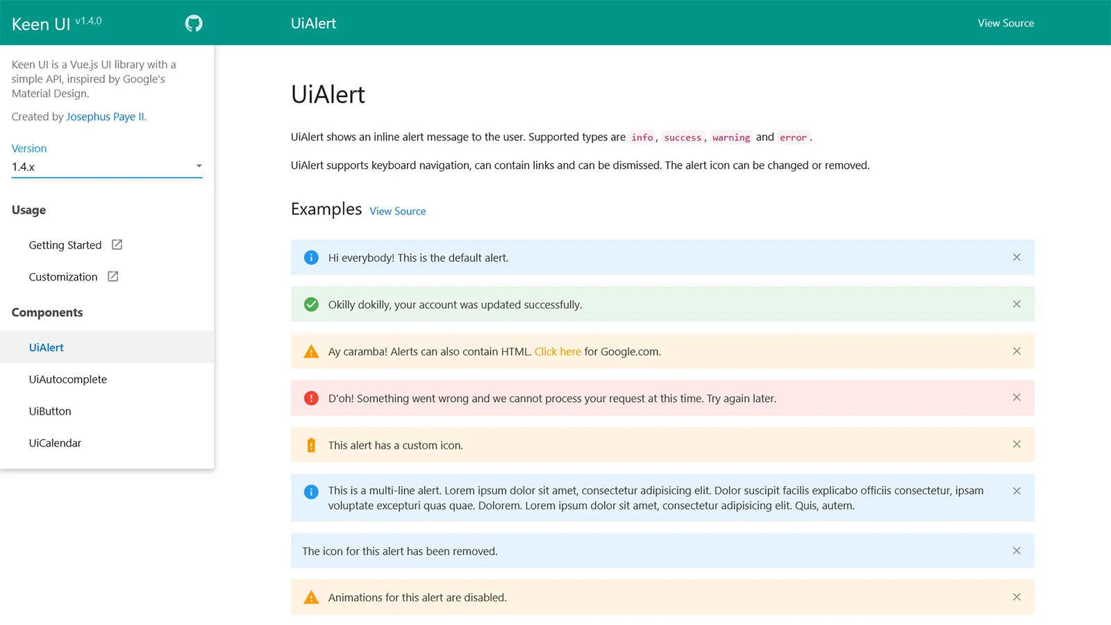
Keen UI is a lightweight Vue library that provides a comprehensive set of customizable UI components. Designed with clarity and flexibility, Keen UI facilitates the building of everyday user interfaces by offering a spectrum of components, from essential elements to advanced widgets. Whether creating a simple landing page or a complex web application, Keen UI provides the mechanisms to bring your design concept to life.
- Modular and Lightweight: Keen UI follows a modular architecture, allowing developers to import only the components they need for their projects. This modular approach helps keep the bundle size small, ensuring fast load times and optimal performance – a crucial aspect for web applications.
- Responsive Design: In today’s multi-device world, responsive design is non-negotiable. Keen UI facilitates the creation of responsive layouts with ease, providing components that adapt seamlessly to different screen sizes and resolutions. Whether your users are accessing your application on a desktop, tablet, or smartphone, they’ll enjoy a consistent and user-friendly experience.
- Accessibility: Accessibility is a core principle of Keen UI. All components are designed with accessibility in mind, ensuring compliance with web accessibility standards such as WCAG. From proper keyboard navigation to semantic markup and ARIA attributes, Keen UI components are accessible to all users, including those with disabilities.
- Customization and Theming: Every project has unique design requirements, and Keen UI recognizes the importance of customization. The library offers extensive customization options, allowing developers to tailor the appearance and behavior of components to match their brand identity or design preferences. Additionally, Keen UI supports theming, making it easy to create custom themes or integrate with popular CSS frameworks like Bootstrap or Tailwind CSS.
Mint UI

Mint Mobile UI is a Vue component library crafted to facilitate the development of mobile applications, emphasizing performance, aesthetics, and usability. Created by the same team behind Mint UI, Mint Mobile UI offers a curated collection of components explicitly tailored for mobile app development. From navigation and tab bars to form inputs and action sheets, Mint Mobile UI provides the essential building blocks to create sleek and functional mobile interfaces.
- Mobile-Optimized Components: Mint Mobile UI offers a comprehensive suite of mobile-optimized components designed to deliver seamless experiences across various screen sizes and devices. Whether you’re targeting smartphones or tablets, Mint Mobile UI components adapt gracefully to different viewport sizes, ensuring a consistent and intuitive user experience.
- Gesture Support: Mobile applications often rely on gestures for user interaction, and Mint Mobile UI provides robust support for common touch gestures such as swipe, tap, and pinch. With intuitive gesture handling built into its components, Mint Mobile UI makes it easy to implement touch-based interactions that feel natural and responsive.
- Smooth Transitions and Animations: Animations play a crucial role in enhancing mobile applications’ usability and visual appeal. Mint Mobile UI includes pre-built transitions and animations that you can seamlessly integrate into your Vue.js apps to create engaging user experiences. Whether it’s sliding panels, fading elements, or smooth transitions between screens, Mint Mobile UI offers various animation options.
- Customization and Theming: Mint Mobile UI provides extensive customization options, allowing you to tailor the appearance and behavior of components to match your app’s branding and design language. Whether you prefer a light or dark theme or if you want to create a custom theme from scratch, Mint Mobile UI makes it easy to achieve the desired look and feel for your mobile app.
PrimeVue

PrimeVue is a rich collection of UI components designed specifically for Vue applications. Developed by PrimeTek Informatics, PrimeVue offers a wide range of meticulously crafted components, from essential elements like buttons and inputs to advanced widgets like data tables and charts. Whether building a simple website or a complex enterprise application, PrimeVue provides the tools you need to deliver exceptional user experiences.
- Extensive Component Library: PrimeVue boasts an extensive collection of UI components, covering virtually every aspect of modern web development. From form elements and layout components to data visualization tools and interactive widgets, PrimeVue offers a comprehensive suite of components to meet the diverse needs of developers.
- Rich and Responsive Design: With a focus on aesthetics and usability, PrimeVue components are designed to be visually appealing and responsive. Whether you’re targeting desktop browsers, tablets, or smartphones, PrimeVue components adapt seamlessly to different screen sizes and resolutions, ensuring a consistent and intuitive user experience across devices.
- Accessibility: Accessibility is a fundamental aspect of web development, and PrimeVue takes this responsibility seriously. All components are designed with accessibility in mind, with proper keyboard navigation, ARIA attributes, and semantic markup to ensure compatibility with screen readers and assistive technologies. By prioritizing accessibility, PrimeVue enables developers to create inclusive and accessible web applications that everyone can use, regardless of their abilities.
- Customization and Theming: PrimeVue provides extensive customization options, allowing developers to tailor the appearance and behavior of components to match their design requirements. Whether you’re adjusting colors, fonts, or spacing, PrimeVue makes it easy to create custom themes that reflect your brand identity or design preferences. PrimeVue seamlessly integrates with popular CSS frameworks like Bootstrap and Material Design, enabling developers to leverage existing styles and design patterns in their applications.
Quasar

Quasar UI is a versatile Vue framework that provides a rich set of components, plugins, and utilities for building modern web applications. Developed with a focus on performance, accessibility, and developer experience, Quasar UI simplifies creating responsive and feature-rich user interfaces. Whether building a simple website, a progressive web app, or a mobile application, Quasar UI offers the tools to bring your design vision to life.
- Extensive Component Library: Quasar UI boasts an extensive collection of UI components, covering everything from essential elements like buttons and inputs to advanced components like data tables, sliders, and charts. With over 100 components to choose from, Quasar UI provides developers with the flexibility to create diverse and visually appealing user interfaces.
- Responsive Design: With mobile devices accounting for a significant portion of web traffic, responsive design has become essential for modern web applications. Quasar UI simplifies creating responsive layouts with built-in support for responsive grids, flexbox utilities, and media queries. Whether your users are accessing your application on a desktop, tablet, or smartphone, Quasar UI ensures a seamless and optimized experience.
- Material Design and iOS Themes: Quasar UI offers built-in support for both Material Design and iOS design languages, allowing developers to choose the style that best suits their application’s aesthetic. Whether you prefer the sleek and modern look of Material Design or the clean and minimalist design of iOS, Quasar UI provides the tools and resources to create visually stunning interfaces that align with your design preferences.
- Cross-Platform Development: One of the standout features of Quasar UI is its support for cross-platform development. With Quasar CLI, developers can build web applications, progressive web apps (PWAs), and even mobile applications for iOS and Android – all from a single codebase. And it not only simplifies the development process, reduces maintenance overhead, and accelerates time-to-market.
Vuestic UI
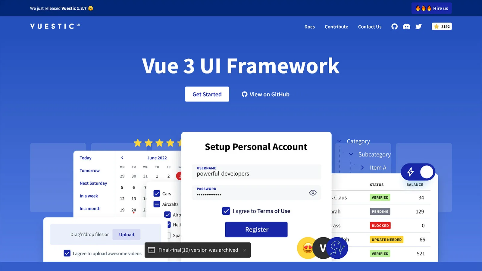
Vuestic UI is a versatile Vue framework that empowers developers to create sleek and intuitive user interfaces. Developed by Epicmax, Vuestic UI provides a rich collection of components, plugins, and utilities that cater to various use cases, from essential elements to complex widgets. Whether building a simple dashboard, an admin panel, or a full-fledged web application, Vuestic UI offers the tools and resources to bring your design vision to life.
- Comprehensive Component Library: Vuestic UI boasts extensive UI components covering various functionalities. From navigation menus and forms to data tables and charts, Vuestic UI provides a comprehensive suite of components to address the diverse needs of developers. Each element is meticulously crafted to be visually appealing and highly functional, ensuring a seamless user experience.
- Responsive Design: With the proliferation of mobile devices, responsive design has become necessary for modern web applications. Vuestic UI prioritizes responsiveness, offering components that adapt seamlessly to screen sizes and resolutions. Whether your users are accessing your application on a desktop, tablet, or smartphone, Vuestic UI ensures a consistent and optimized experience across devices.
- Customization and Theming: Vuestic UI provides extensive customization options, allowing developers to tailor the appearance and behavior of components to match their design requirements. Whether you’re adjusting colors, typography, or layout, Vuestic UI makes it easy to create custom themes that reflect your brand identity or design preferences. Additionally, Vuestic UI seamlessly integrates with popular CSS frameworks like Bootstrap and Bulma, enabling developers to leverage existing styles and design patterns in their applications.
- Modular Architecture: Vuestic UI follows a modular architecture, allowing developers to import only the components and utilities they need for their projects. This modular approach helps keep the bundle size small, ensuring fast load times and optimal performance – a crucial aspect for web applications.
Vant 4

Vant 4 is the latest iteration of the popular Vant UI library, designed to provide developers with a versatile set of components and tools for building exceptional user interfaces. Developed by Youzan, Vant 4 inherits the strengths of its predecessors while introducing new features, optimizations, and improvements to enhance the development experience. With a focus on performance, accessibility, and developer ergonomics, Vant 4 empowers developers to create responsive, intuitive, and visually appealing UIs easily.
- Extensive Component Library: Vant 4 offers an extensive collection of UI components, covering a wide range of use cases. From essential elements like buttons and inputs to complex components like carousels and calendars, Vant 4 provides developers with the building blocks they need to create diverse and feature-rich user interfaces.
- Modular Architecture: Vant 4 follows a modular architecture, allowing developers to import only the components they need for their projects. This modular approach helps keep the bundle size small, resulting in faster load times and improved performance – essential factors for delivering a seamless user experience.
- Customization and Theming: Vant 4 provides extensive customization options, allowing developers to tailor the appearance and behavior of components to match their design requirements. Whether you’re adjusting colors, typography, or spacing, Vant 4 makes it easy to create custom themes that reflect your brand identity or design preferences. Additionally, Vant 4 seamlessly integrates with popular CSS frameworks like Bootstrap and Tailwind CSS, enabling developers to leverage existing styles and design patterns in their applications.
- Accessibility: Accessibility is a core principle of Vant 4, with all components designed to be fully accessible to users of all abilities. From proper keyboard navigation to semantic markup and ARIA attributes, Vant 4 ensures that web applications built with the library are usable by everyone, including those using assistive technologies.
Vuetify

Vuetify UI is a comprehensive Vue framework that provides developers with a vast array of pre-designed components, themes, and tools for building modern web applications. Developed by the creators of Vue.js Material Design, Vuetify UI is built on top of Google’s Material Design guidelines, offering developers a familiar and visually appealing design language to work with. With a focus on simplicity, accessibility, and customization, Vuetify UI simplifies creating beautiful and functional user interfaces with Vue.
- Material Design Components: Vuetify UI offers a rich collection of Material Design-inspired components, covering everything from buttons and inputs to complex components like data tables and dialogs. Each element is meticulously designed to adhere to Google’s Material Design guidelines, ensuring a consistent and intuitive user experience across applications.
- Responsive Design: With the rise of mobile devices, responsive design has become essential for modern web applications. Vuetify UI prioritizes responsiveness, offering components that automatically adapt to different screen sizes and resolutions. Whether your users are accessing your application on a desktop, tablet, or smartphone, Vuetify UI ensures a seamless and optimized experience across devices.
- Customization and Theming: Vuetify UI provides extensive customization options, allowing developers to tailor the appearance and behavior of components to match their design requirements. Whether you’re adjusting colors, typography, or spacing, Vuetify UI makes it easy to create custom themes that reflect your brand identity or design preferences. Additionally, Vuetify UI supports theming at both the global and component levels, giving developers complete control over the visual style of their applications.
- Accessibility: Accessibility is a core principle of Vuetify UI, with all components designed to be fully accessible to users of all abilities. From proper keyboard navigation to semantic markup and ARIA attributes, Vuetify UI ensures that web applications built with the framework are usable by everyone, including those using assistive technologies.
Vux
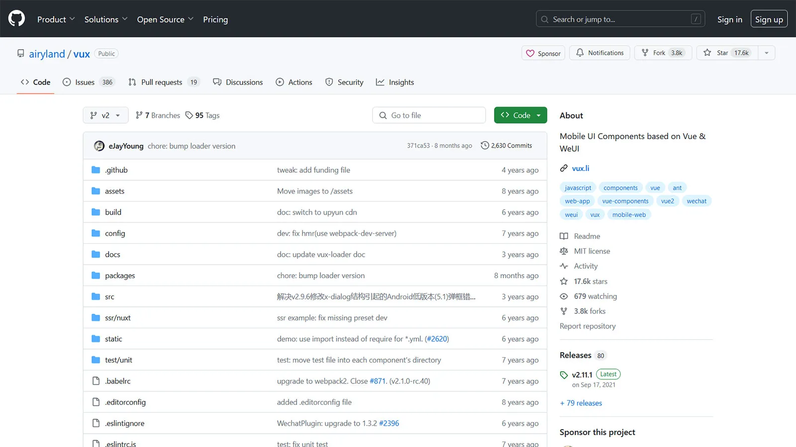
Vux UI is a versatile Vue framework that provides developers with various pre-designed components, plugins, and utilities for building modern web applications. Developed by the creators of WeChat, Vux UI draws inspiration from the design language of WeChat’s official account interface, offering developers a familiar and visually appealing design aesthetic to work with. With a focus on performance, accessibility, and customization, Vux UI simplifies the creation of sleek and intuitive user interfaces with Vue.
- WeChat-Inspired Components: Vux UI offers a rich collection of components inspired by the design language of WeChat’s official account interface. From essential elements like buttons and inputs to complex components like lists, cards, and action sheets, Vux UI provides developers with the building blocks they need to create visually appealing and highly functional user interfaces.
- Mobile-Optimized Design: With the increasing prevalence of mobile devices, mobile optimization has become essential for modern web applications. Vux UI prioritizes mobile optimization, offering components that are specifically designed for use on smartphones and tablets. Whether your users are accessing your application on an iPhone or an Android device, Vux UI ensures a seamless and optimized experience across mobile platforms.
- Customization and Theming: Vux UI provides extensive customization options, allowing developers to tailor the appearance and behavior of components to match their design requirements. Whether you’re adjusting colors, typography, or layout, Vux UI makes it easy to create custom themes that reflect your brand identity or design preferences. Additionally, Vux UI seamlessly integrates with popular CSS frameworks like Bootstrap and Bulma, enabling developers to leverage existing styles and design patterns in their applications.
- Accessibility: Accessibility is a core principle of Vux UI, with all components designed to be fully accessible to users of all abilities. From proper keyboard navigation to semantic markup and ARIA attributes, Vux UI ensures that web applications built with the framework are usable by everyone, including those using assistive technologies.
Vue Material
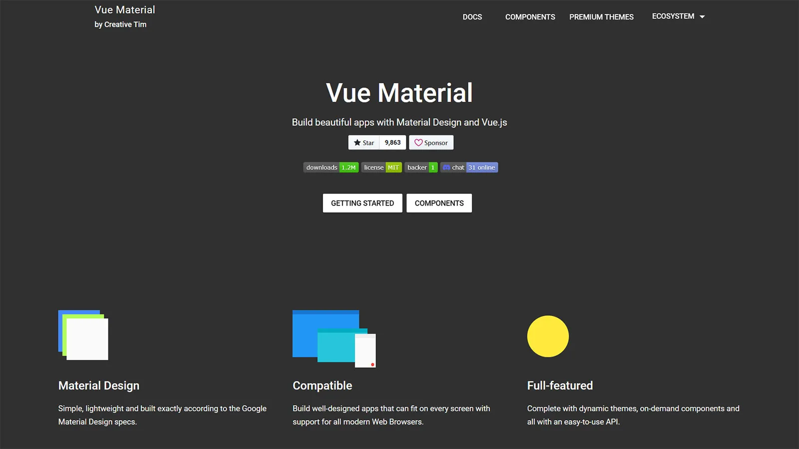
Vue Material is a robust UI framework explicitly built for Vue applications, providing developers with a wide range of pre-designed components, themes, and utilities. Developed by the creators of Vue.js, Vue Material draws inspiration from Google’s Material Design guidelines, offering developers a familiar and visually appealing design language to work with. With a focus on performance, accessibility, and customization, Vue Material simplifies creating elegant and responsive user interfaces with Vue.
- Material Design Components: Vue Material offers a comprehensive collection of components inspired by Google’s Material Design guidelines. Vue Material provides developers with a rich set of components to build modern and visually appealing user interfaces, from buttons and inputs to cards, dialogs, and data tables.
- Responsive Design: With the proliferation of mobile devices, responsive design has become essential for modern web applications. Vue Material prioritizes responsiveness, offering components that automatically adapt to different screen sizes and resolutions. Whether your users are accessing your application on a desktop, tablet, or smartphone, Vue Material ensures a seamless and optimized experience across devices.
- Customization and Theming: Vue Material provides extensive customization options, allowing developers to tailor the appearance and behavior of components to match their design requirements. Whether you’re adjusting colors, typography, or layout, Vue Material makes it easy to create custom themes that reflect your brand identity or design preferences. Additionally, Vue Material seamlessly integrates with popular CSS frameworks like Bootstrap and Bulma, enabling developers to leverage existing styles and design patterns in their applications.
- Accessibility: Accessibility is a core principle of Vue Material, with all components designed to be fully accessible to users of all abilities. From proper keyboard navigation to semantic markup and ARIA attributes, Vue Material ensures that web applications built with the framework are usable by everyone, including those using assistive technologies.
Bootstrap 5 Components
Bootstrap Login Forms, Bootstrap 5 Snippets, Bootstrap Cards, Bootstrap Carousels, Bootstrap Heroes, Bootstrap Footers
Related Posts
Browse our collection of related blog posts, where we delve deep into the fascinating design and development world. Whether you’re a seasoned enthusiast looking to expand your knowledge or a curious newcomer eager to learn more, this compilation of articles will serve as your guiding light.


